The COVID-19 pandemic is challenging companies across all industries to quickly adjust to shifts in their customer’s needs.
During volatile times like this, remaining aware of user behavior on your website and ensuring accurate data is populating into Google Analytics is of the utmost importance. However, knowing what data points to check and finding the time to do so can be a difficult task.
To make it easier to monitor Google Analytics data, we’ve created a Google Data Studio dashboard template for you to use as a diagnostic tool.
You can easily plug in data from your Google Analytics account and start monitoring traffic immediately (after a little custom configuration). The dashboard will quickly raise “smoke alarms” that you can dig in on to better understand your audience’s shifting needs and how you can support them during this time. It can also be used after the pandemic passes to continue to ensure your Google Analytics data remains healthy and to stay up to date on site trends.
Make a copy of the dashboard below in order to follow along with the steps in this post and be on your way to easily monitoring your Google Analytics data during COVID-19 (and after!).
How to Setup Your New Dashboard
1) Make a Copy & Connect Your Data
Ensure that you’re logged into the Google account that has access to your Google Analytics data and add your main reporting view as the new data source.
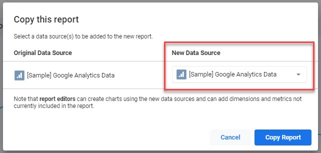
After clicking “Copy Report”, it will use your data source to create an adjustable copy of the 4-page dashboard. We recommend that you give the dashboard an initial scan to ensure that no visuals broke during the data source transfer.
2) Customize Your Pages
PAGES 1 & 2: DATA DIAGNOSTIC

The first two pages of the dashboard contain universal metrics that you should be monitoring for most, if not all, of your Google Analytics views.
However, if there are visuals that are not relevant to your site’s data, feel free to delete or replace any charts in the dashboard.
In Edit mode, click the three dots to rename, duplicate, hide, or delete a page in Google Data Studio. More beginner's tips here.
PAGE 3: GOAL COMPLETIONS
Page 3 aims to help monitor your Google Analytics Goals. It’s important to keep a close eye on how your goals are trending, as these are typically key indicators of your website’s performance, which ultimately may lead to your overall business objectives.
You’ll notice that Page 3 contains 20 slots to hold potential goal data. While Google Analytics allows for up to 20 goals per view, you may not have all 20 goal slots in use.

You may want to delete unused scorecards to reduce the noise in your dashboard. In the free space, you can add any other visuals that may be relevant to how you monitor your Google Analytics goals.
Additionally, you can Edit the time series chart above the cards to visualize your most important goals. We recommend keeping under 5 goals within this visual to keep it from being cluttered and allow the end user to easily analyze the data within the chart.
PAGE 4: ECOMMERCE
Lastly, Page 4 contains visuals to help monitor Ecommerce product and revenue data.
If you do not have Ecommerce reporting enabled in Google Analytics, feel free to delete this page altogether.
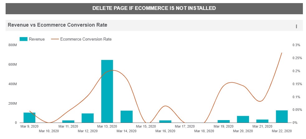
If you do have Ecommerce enabled, however, this report can be used to monitor for anomalous spikes or drastic drop offs in your core sales metrics. More on analyzing Ecommerce data in Google Analytics.
How to Use Your New Dashboard as a Diagnostic Tool
Monitor Shifts & Outliers
Now that your dashboard is all setup and customized to you, it can start being used as a diagnostic tool to monitor your data! We recommend you check the dashboard multiple times per week to ensure you are staying up to date with shifting user needs during this time. Look for:
- Spikes in internal traffic coming from remote team members whose personal IPs may not be filtered out in Google Analytics.
- Significant changes in users located in regions that are heavily impacted by COVID-19.
- Benchmarking any events or goals related to user activity that may be affected by the economic impacts of COVID-19.
For more details on what to look out for in your data, read this post about the impact of COVID-19 on Analytics.
We also recommend that you continue to monitor your data at least weekly after the pandemic ends. This will help you catch shifts in site traffic behavior, identify broken tracking, or spot user experience issues sooner rather than later.
Schedule Email Delivery
Google Data Studio has an automated email delivery feature that allows you to send an up-to-date copy of your dashboards to your inbox on a predetermined basis. At Seer, we like to send our dashboards to our inboxes every Friday so that we have a weekly reminder to check on our data.
Here’s how to set up an automated email delivery in Data Studio:
Click the drop down menu next to Share and choose “Schedule email delivery”.
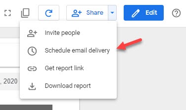
Next, add the appropriate recipients and choose your delivery cadence.
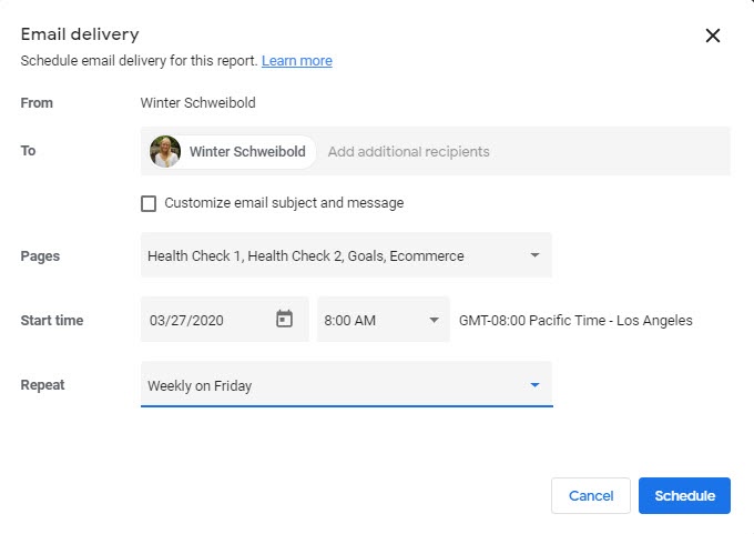
If you have multiple Google Analytics views to monitor, we recommend making a copy of the dashboard for each view, as the automated email delivery will send a copy of the dashboard using the current data source.
You can schedule it to send every day if you’d like to use it as a daily gut check -- but keep the other Share options in mind if you’d rather it live outside of your inbox.
Toggle Google Analytics Views
If you’re juggling between multiple Google Analytics Views, you can also use the data control feature that allows you to change between different data sources (as long as they are within the same Google account).

This will allow you to easily review your multiple Google Analytics views without having to create multiple dashboards. If you don’t want to take the time to create individual dashboards for each of your views, you may find this method is simpler.
The only caveats are the lengthier load time induced by toggling between data sources, as well as the potential for calculated fields (like goal names, Ecommerce variables, Custom Dimensions, or Custom Metrics) to break between views.
Continue Monitoring Data Regularly
Your site’s data is more important now than ever. Using this dashboard to monitor variation in user behavior and avoid lingering tracking issues will help you stay ahead of the curve and respond quickly to your user’s changing needs.
If you have any other questions around how Seer can help your company’s site, feel free to reach out to us here.

