Solve Business Problems with User Experience (UX) Design
We’re constantly asked, “what’s the silver bullet to solve my user experience needs?” I wish I had a simple answer. But the truth is, it's continuously evolving with digital trends, accessibility guidelines, and technological advancements.
What is UX?
User experience (UX) design is a discipline within digital creative that focuses on the user. The goal is to help users solve a problem or take action in a frictionless way.
Good UX design enables streamlined and delightful visits to your site for everyone at every phase of their journey.
You might ask:
- How do you get to a good user experience?
- How do you know where your site stands in regards to UX?
- How do you improve it?
Rarely do we look at our own sites and think, “this looks bad”. Instead, we have business problems to solve. That’s why we all have websites in the first place, right? To support and grow our businesses.
Your business goals or pain points can reveal a lot about the experiences on your site.
In this post, we'll uncover how UX design can help your business:
- Generate More Sales or Qualified Leads
- Grow Conversion Rate with the Same Traffic
- Expand Awareness & Improve Brand Strength
- Boost User Satisfaction
- Maximize Site ROI
Generate More Sales or Qualified Leads
Are you asking:
- Do I understand my site’s priority user journeys, and how I want users to interact with my site?
- Do I have the Analytics data to prove that’s what is actually happening?
- Does our website contribute directly to our primary KPIs?
Regardless of the quality, when users visit your site -- they’re having an experience.
Meaningful UX increases your chances of convincing that user to take the actions that best serve your business, whether that’s filling out a form or making a purchase.
When an experience is designed properly, users should not have to actively think about the hoops they’re jumping through. Your site should have the common elements used across a majority of digital experiences.

A site’s main navigation bar is typically at the top of the page, rather than in the bottom left corner, and that’s where visitors expect it to be.
You need to understand your target audiences, what makes your users special, and how to create an intuitive UX for them.
💡 Consider this quote from ZURB President, Bryan Zmijewski:
“The designers that work on Amazon don’t create the experience— they’re responsible for building the system, product and service that allowed those different experiences to happen. The designers work to understand how the user interacts with the website to create the most desirable and profitable experiences.”
Are the updates made to your site increasing logins, signups, purchases, or whatever it is that are your primary conversions? If not, you may consider investing in either:
- UX Competitive Analysis
- See how others in your industry tackle similar problems and challenges
- UX Audit
- Review your site to identify the sticking points that cause users to take actions outside of the journey you want them to take

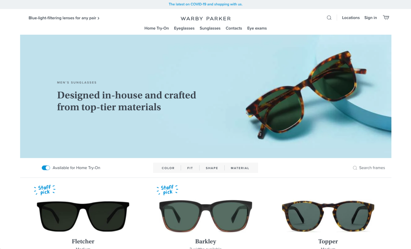
A sleek & useful top navigation, a clear core value proposition in the hero, and an automatically toggled-on “Available for Home Try-on” feature immediately streamline products presented to the user with minimal effort.
Grow Conversion Rate with the Same Traffic
Are you asking:
- Am I driving my upcoming paid campaigns to custom landing pages?
- Why is my bounce rate and % exit high on key pages of my site?
- How do I convert my current site visitors into prospects?
Admittedly, these questions can fall into UX and/or CRO territory.
There are tactics that can be used to conduct A/B tests with low traffic to optimize elements of your user experience and nudge your existing visitors lower down the funnel.
Utilizing tools like Hotjar or Audience interviews and polls can provide insight into why conversion metrics are remaining flat or decreasing. This data can lead to an iterative site-wide optimization strategy.
Maybe your site needs additional CTAs that are specific to educational or product/service pages. Maybe you need to rethink your user journeys by cross-linking awareness content with elements that lead users towards conversion to build experience bridges throughout your site. And so on.
UX Design in Action
Seer’s Creative team recently designed a cohesive UX/UI component library to pair with a blog launch for an ecommerce client.
💡 By scaling components with the same purpose across multiple pages (i.e. using the same product component layout twice on one page) -- our client saw:
- 38% decrease in homepage exits period-over-period
- 19% increase in returning site visitors

Leveraging a variety of scalable yet consistent components creates a unified experience and empowers users to interact with content, imagery, and CTAs.
Taking a holistic UX approach, beyond just the element or page level, is key to increasing conversions. Your users have multiple touchpoints with your brand, from clicking on an ad and visiting a landing page, to viewing articles, reading frequently asked questions, or moving through a purchase flow.
Expand Awareness & Improve Brand Strength
Are you asking:
- What is high-value content on my site?
- Are users’ initial blockers easily resolved after viewing this content?
- How do I increase my organic traffic?
Typically, creating a resource hub or blog can improve your organic search rankings and drive brand awareness. Hubs should:
- Encourage exploration
- Frictionless offshoots from blog articles to product/service pages
- Integrate into your larger existing site
- Reuse content components when possible and create new components only when there is a strong use case
- Champion your brand tone, voice & visuals
- Imagery should support the content it surrounds, whether it’s an infographic, animation, or custom illustration
- Support a variety of content lengths, categories, and formats
- UX should be built to scale across content and device types
As you invest resources into increasing traffic, ensure that your site is properly optimized across multiple breakpoints to support desktop and mobile experiences.
Your organic landing pages should have minimal interstitials and pop-ups - early-stage users’ natural reactions are to either quickly close a pop-up, or leave altogether.
User experience is not exempt from brand - for example, if you’re an ecommerce shoe company with a playful and bright tone and voice, your UX should reflect that.

Prioritizing an easy-to-access variety of color swatches in your product views not only encourages browsability from a UX perspective, but it also reinforces your brand’s bright personality.
Boost User Satisfaction
Are you asking:
- How do I beat my competitors and become the go-to digital experience in my industry?
- Is it easy for me or our content managers to build new templatized pages as needed with intuitive content modules?
💡 Marketing Charts shows that:
"47% of consumers will tell others about a bad web experience they had and are less likely to return to the site. Conversely, quality UX provides an intuitive experience for users and it can delight them."
Updated experience designs can address:
- Walls of text:
- Break up text blocks with custom imagery and video content that stimulates readers and encourages them to continue exploring your content. Text block components should be built to incorporate these visual elements.
- CTA hierarchy:
- Identify your primary, secondary, and tertiary CTAs and design buttons and text links accordingly - consolidate button copy, use cases, and ensure links are optimized for mobile.
- Trust signals:
- Prioritize content and subsequent UX components that clearly define your unique value proposition or a page’s benefit to the user above the fold
- Content Manager experience:
- UX doesn’t end with your site visitors - it includes the people who manage and create new content for your site every day. Designing a flexible and scalable component library with clear use cases improves your employees’ site experience and increases productivity.

Clearly-labeled quick links above the fold to popular resources allow users to find exactly what they’re looking for in a short amount of time.
Maximize Site ROI
Are you asking:
- Do I have an in-house design team?
- What are their strengths and weaknesses? And do those align with our top-priority initiatives?
Regardless of whether you’re driving Paid Social and Search campaigns to your site, and your pages are all correctly tagged and tracking, and your content is optimized for organic search - if your experience is outdated or difficult to use, you'll lose people.

UX elements are the building blocks of your company’s digital presence - optimizations should be made while keeping all layers of the experience in mind to ensure cohesion.
It’s imperative to protect your investments in digital marketing by continuously updating your user experience and interface.
UX is Key for Sustainable Success
UX can impact your revenue, brand positioning, and retention -- it should be given just as much thought, dedication, and time/resource investment as your Paid campaigns, Analytics setup, or SEO.
What Now?
See Our Work
🚀 If you’ve asked one or more of the questions in this post, or need your site to solve a business problem (which every website should!) -- Seer Creative can help!
Learn More
🧷 Keep exploring posts from Seer's UX Checklist Series:
- Landing Page Design
- Form Design
- Button Design
- Navigation Design
- Accessible Design
- Ecommerce Design
- Display Ad Design


