This post is from our User Experience (UX) Checklist Series:
- Landing Page Design
- Form Design
- Button Design
- Navigation Design
- Accessible Design
- Ecommerce Design
- Display Ad Design
In the wake of COVID-19, digital strategies are more important than ever before. When it comes to Ecommerce sites, your online store is your moment to prove value to potential customers. It’s your platform to stand out in an oversaturated digital landscape, and as such, you need to quickly prove quality, value, and credibility. And if your message doesn’t get across, 79% of visitors will leave your site.
Cyber Monday is on track to smash through every previous years’ records. Last year, the National Retail Federation (NRF) reported that there were a record-high 190 million shoppers from Thanksgiving through Cyber Monday. In response to COVID-19, Amazon Prime Day was moved from July to October, recording $3.5 billion in sales--a 60% increase compared to 2019’s event. In efforts to keep up, many digital retailers kicked off holiday shopping sales in October as well, with no slow down in sight.
How can you compete in this space when big businesses like Amazon are eating up online sales? Improve Ecommerce UX & UI design.
Keep reading for tips to maximize your Ecommerce site experience this holiday season.
Product Page Experience & Design
Create experiences that allow visitors to find what they’re looking for as quickly and easily as possible.
Make It Easy & Give People Options
94% of the time, first impressions are design-related. Typically, websites with excellent visual design are more user-friendly.
You should create an experience that allows a visitor to find what they’re looking for as quickly and easily as possible, while giving them just enough information needed to make a purchasing decision.
For example, users like to be able to apply filters on pages with lots of options because it cuts out the noise and lets them focus on what they care about, not everything you want to show them.
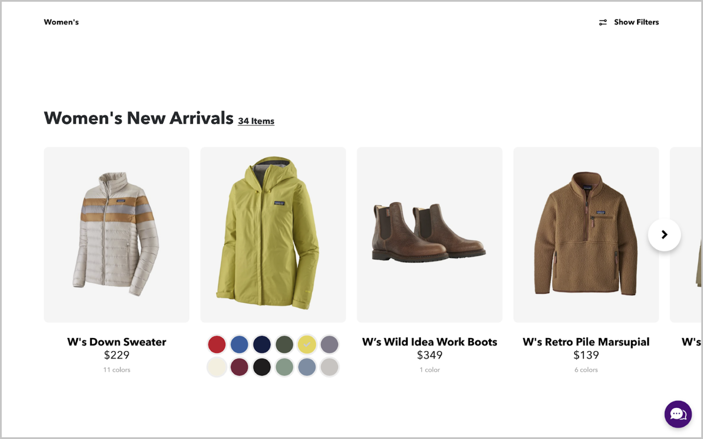
Patagonia provides color options, pricing, and multiple views of each product before the user clicks on an item.
💡 Learn how to use site search data to optimize Ecommerce product pages.
Use High Quality Photos & Videos
Visitors can’t see your product in real life, so your photos and videos are the only thing a potential customer has to rely on to make a decision. All imagery should be high-quality and consistent with your brand/site experience.
Be sure your site has the ability to zoom in on photos, so that visitors can get up close and personal with your products.
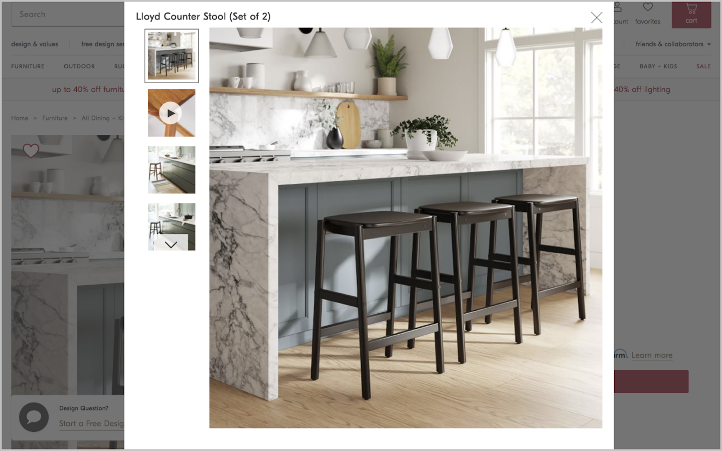
West Elm provides high-quality photos & videos of their product for easy viewing.
Allow Your Products to Shine
A well-designed site is one that is easy to browse and digest. Often, minimal and clean web design allows for visitors to more quickly find what they need -- while a site with all of the bells and whistles may look impressive ... if people can’t find your product, you’re still missing the mark.
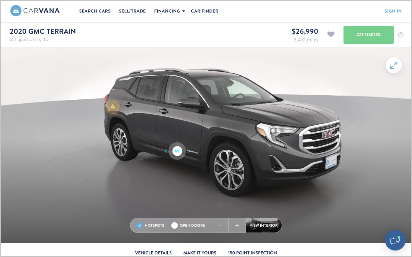
Carvana lets their images do the talking with 360-degree exterior and interior tours.
Leverage Social Proof & Brand Authority
If a visitor hasn’t heard of your company before, provide them with ratings, reviews, and publication feature links so that they can get to know your brand. Transparency is key for digital shoppers.
Depending on your demographic’s values, a visitor may look to support brands that have authentic stories, are environmentally conscious, make regular donations, or are located in a specific region.
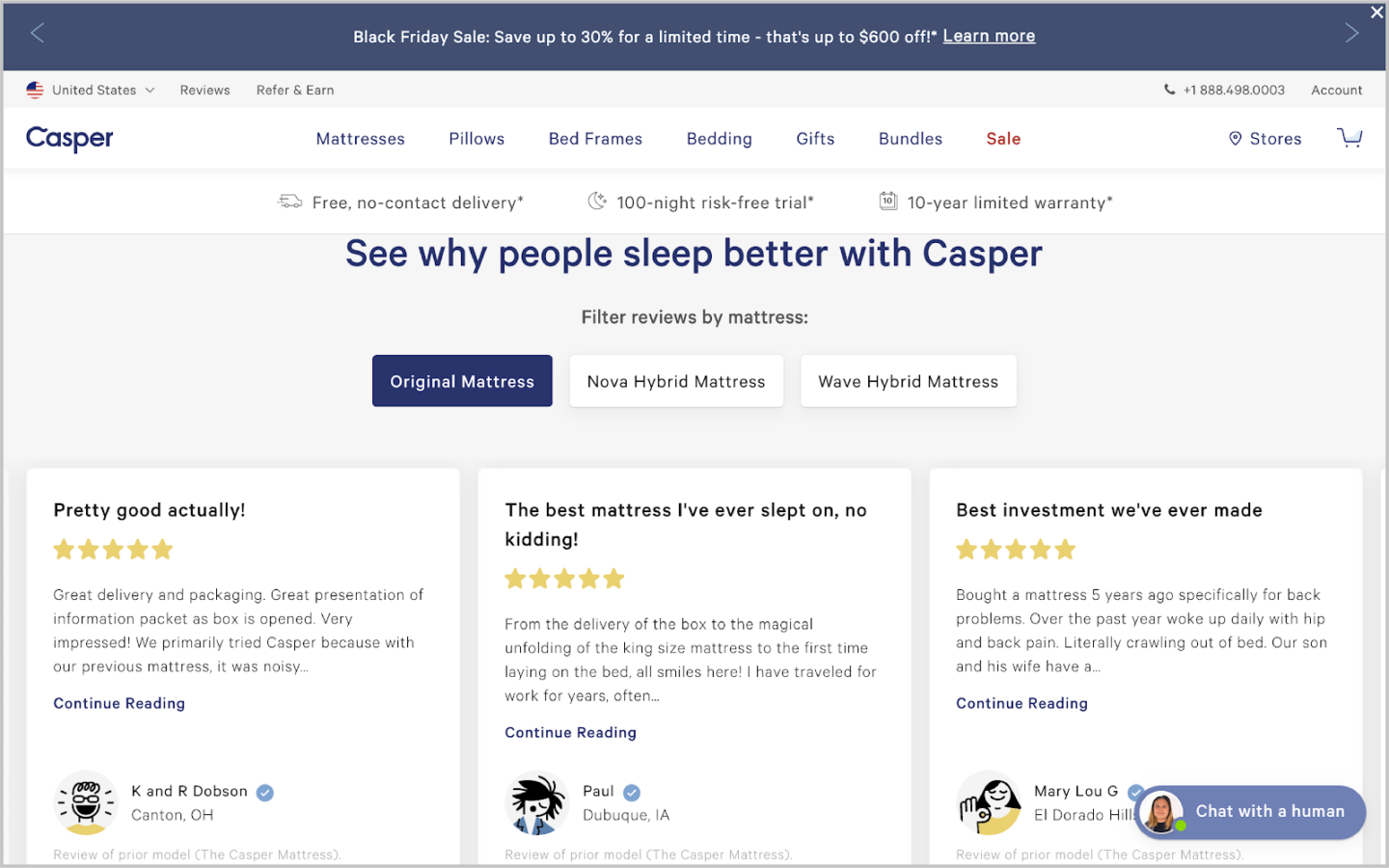
Casper lists easy-to-find reviews on their homepage written by real people.
💡 Remember you are not your audience -- it's important to know what they care about, what motivates them, etc. to build their trust and loyalty.
Answer Questions Before They're Asked
An FAQ page should be featured on your site, as this helps reduce purchasing anxiety and can speed up the checkout process. Include helpful tips & screenshots where applicable to guide users seamlessly through the page.
According to Think with Google, users will flow through an exploration and evaluation process repeatedly, until they’ve made a decision to either purchase your product or leave. By giving a visitor just enough information without overwhelming them, you increase the likelihood of purchase.

Warby Parker shares an organized FAQ list, with holiday shipping-specific questions at the top.
💡 Check out these tips for creating FAQ pages that are SEO-friendly.
Device Experience & Design
More than half of all internet shopping traffic comes from mobile devices. 2019’s Cyber Monday saw $9.2 billion in online revenue, 33% of which came from mobile shoppers.
Yet, a majority of mobile shoppers have experienced difficulty at some point completing a transaction on their phones. This is an indicator of how much room there is to improve customer conversion simply by ensuring a positive UX on desktop and mobile devices.
Reduce Unnecessary Steps
As a general rule of thumb, customers should be able to find the product they’re looking for and complete a purchase in the fewest steps possible -- no matter which device they're on.
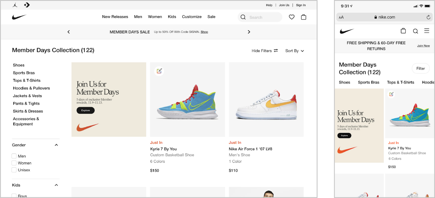
Nike has a sleek, minimalist design that aims to create a positive CX across both desktop and mobile.
💡 Read my post on navigation design for desktop & mobile to dive further into best practices.
Checkout Experience & Design
Your website should inspire a visitor to not only click the “Buy Now” button, but also to follow through on their purchase.
Prioritize Convenience & Speed
People shop online for convenience. If your site is slowing down their experience at all, a potential customer will likely leave your site to find their desired product elsewhere.
According to Barilliance, one of the largest causes of cart abandonment comes from having to create a New User account at checkout. Good UX should allow for a customer to checkout as a guest, while still encouraging account creation.
This experience gives the customer the option to have a speedy checkout, while also showing incentives for setting up an account on your site.
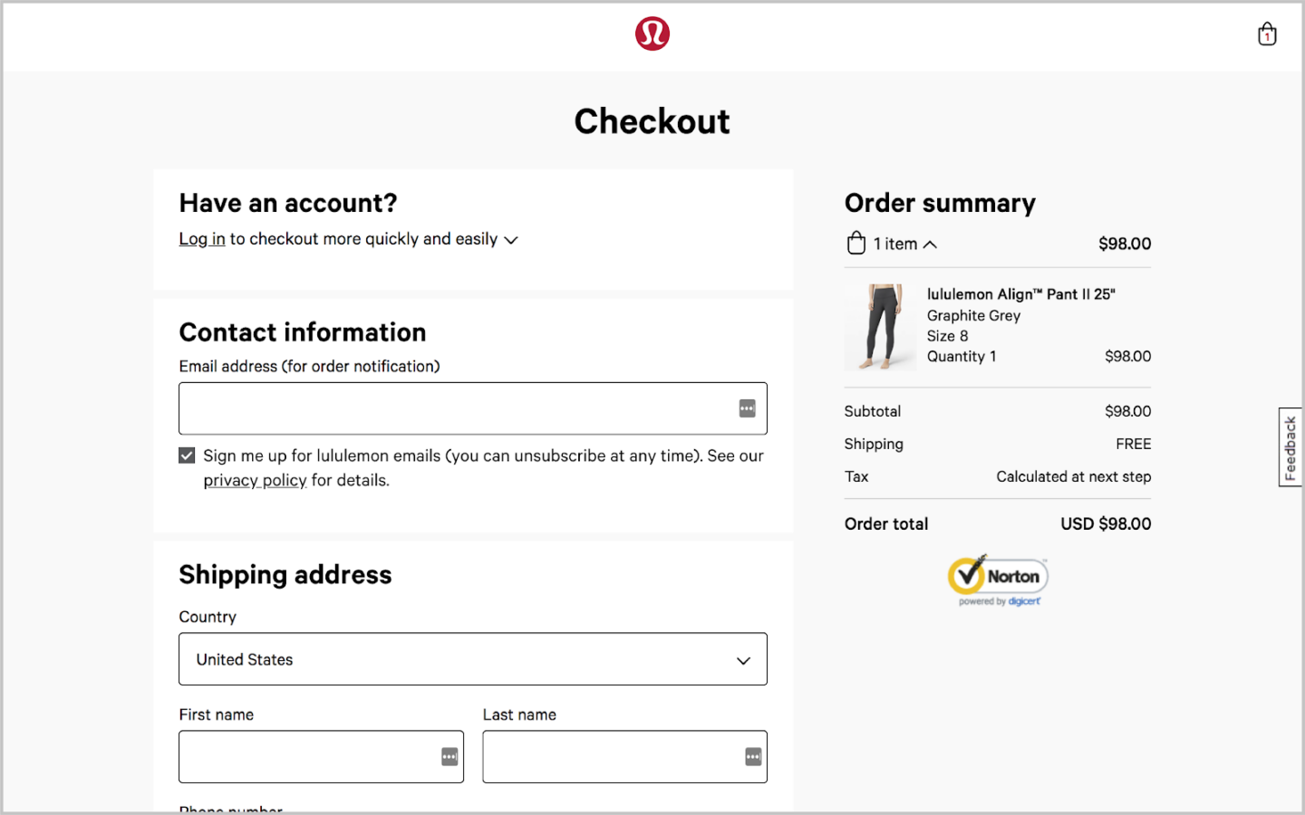
Lululemon allows for customers to checkout as guests, but incentives account signup with a faster & easier checkout process.
💡 Some brands incentivize account sign ups through coupons and offers -- read about coupon codes and coupons on other sites.
Next Steps
Visit your website from a computer and a phone. How many clicks or taps does it take to find a product and checkout? How easy and enjoyable was the process? Are you delighted by your purchase and overall experience, or are you ambivalent about it?
To stand out in today’s digital market, you need to not only have an excellent product, but a beautifully designed site to purchase it on.
- Interested in conducting a data-driven UX/UI audit? Contact our Creative Team to learn more. We’re here to help!
- Looking for more design best practices? Keep reading our Creative & UX Checklist Series.


