The Challenge
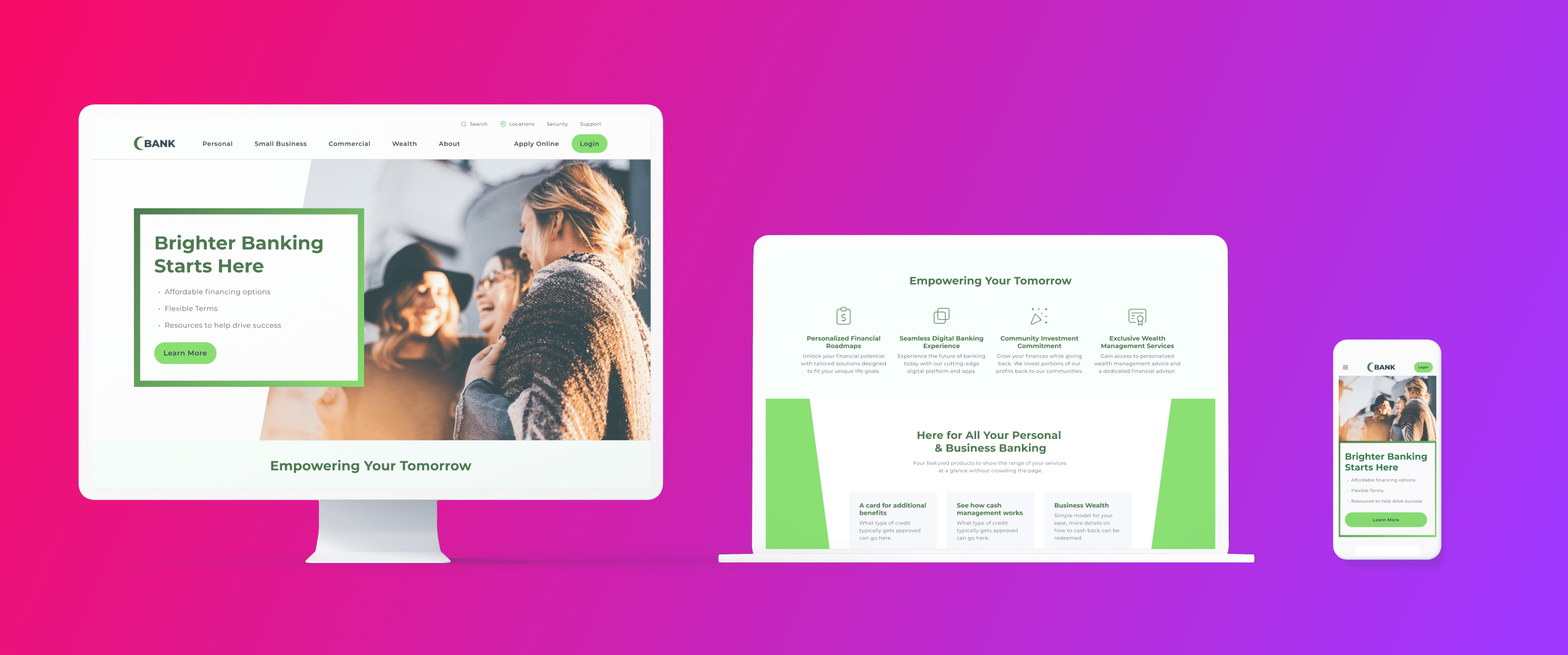
As our banking client’s growth outpaced its digital evolution, their website needed an overhaul to reflect their brand promise and align with customer expectations. A digital transformation was overdue to showcase their expansive services, scale content, and capture search opportunities – as well as offer a faster, more sophisticated look with user-friendly navigation.
The Strategy
Our journey began with a comprehensive Discovery & Analysis, weighing our client’s digital footprint against user needs and the competitive landscape. We poured those insights into overhauled digital brand styles and the website itself with an eye on future growth and content strategy. This involved identifying new information architecture, taking into account search opportunities and balancing them against the needs of different audiences – including large and small banking clients, as well as everyday consumers opening their first checking accounts.
This information architecture informed the creation of flexible templates and content layouts, prioritizing accessibility. Accompanied by an updated image library, we redesigned the site in a way that maintained brand integrity, but better reflected our client’s identity as a modern, sophisticated finance company. Next came a Messaging Framework, giving their team a blueprint for a more consistent tone across 156 pages of content to support the site launch. As the crowning touch, we implemented new, more robust tracking; oversaw development schedules and QA tested throughout, resolving any roadblocks on the path to relaunch.
The Results
Since its migration, redesign, and relaunch, the redesigned website offers a more streamlined navigation experience, making it easier for customers to find the services they need – when they need them. This improvement comes as our client continues to expand its offerings. Enhanced tracking capabilities empower deeper insights into customer engagement and site interactions.
Additionally, the introduction of flexible templates and a centralized content library ensures the site can easily adapt to meet new product offerings and customer demands. Together, these upgrades deliver a one-two punch of helping our client better understand customer behavior, as well as more efficiently pursue emerging search and content opportunities.
Looking for an agency to help your Bank with SEO, PPC, Creative? Learn more about our offering.


