Data can be boring. I’m sorry, but it’s true. Don’t get me wrong, I love a good spreadsheet as much as I love a good novel, but whenever I can get away with it, I’d much rather just see the movie.
Visualization and presentation have never been more important then they are today. The amount of data that we collect, process, and analyze is overwhelming. Have you ever peeked into the backlink profile for a domain that has over a million links? Can you even imagine what a million links looks like? I can’t. Luckily, we’ve come a long way in terms of visualization since the invention of the pie chart.
Introducing . . . Fusion Tables.
In typical Google fashion, Google quietly rolled out a brand new “Experimental” version of their Fusion Table application a few weeks ago. If you haven’t had the chance (or reason) to play with Fusion Tables yet, the time has come. Consider it Google Spreadsheets on steroids, or Google’s answer to “big data.” I’ll be writing a lot more on how to harness the power of Fusion Tables to create massive databases, but for now, I just want to focus on one incredibly awesome feature--the Network Graph.
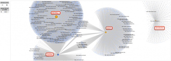
Who said that competitor backlink research couldn’t be fun? Aside from hosting enormous amounts of data, Fusion Tables can also visualize the connections between your data in a simple, interactive map. This new Network Graph feature takes seconds to set up and can have many different applications.
You can view the completed Network Graph and Fusion Table here.
Want to SEE who is linking to you? Here’s how:
1. Gather your data
For this experiment, I gathered the backlink profiles for four companies in the SEO industry, SEER Interactive, Distilled, SEOMoz, and Zamolution (who rank #1 for “Philadelphia SEO Company”). What I wanted to see is how are these four sites connected? I pulled all of this data using SEOMoz’s ever-so-helpful Open Site Explorer. You can gather your data any way you choose.
2. Clean up your data.
If you’re pulling a lot data from a lot different places, you might want to clean it up. Fusion Tables will actually do this for you and you can even merge tables and aggregate data via the web interface, however, it is still “experimental” and there are still some bugs so I prefer to have everything in one pretty .csv.
3. Create a new Fusion Table
Head on over to Google Docs / Google Drive / Whatever We’re Supposed To Call It Now and Create > New Table.
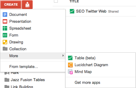
(If there’s no option for Table, try logging in with a non-Google Apps account)
From there, it’s pretty straight forward. You can either upload a CSV, use an existing Google Spreadsheet or create an empty table.
After you’re done uploading, you can choose which columns you want to import.
4. Create a Network Graph
Once you have your massive table of data, you can create your Network graph under Experiment > Network Graph

Set Vertex 1 to URL and Vertex 2 to Target URL and weigh by Number of Links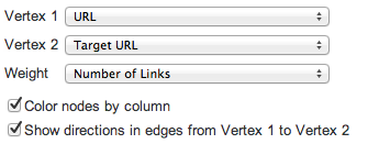
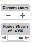
BOOM. That’s it. Now the fun begins.
As you increase the number of nodes shown, more and more blue links begin to appear. At around 2,000 nodes, it’ll start to become unresponsive. You can also use the Filter feature and filter out all links that have a Page Authority lower than 30.
Analyze This
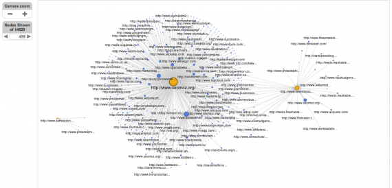
So what does this tell us (other than that SEOMoz = the Death Star)? Well, for starters, if I were an SEO company, I’d want to make sure I was getting a piece of this pie. This visualization gives us a very clear picture on where we’re getting our links from.
Need help identifying a link network? Here’s your tool. Want to find out who the Death Star is in your industry? Here’s your tool.
Social Media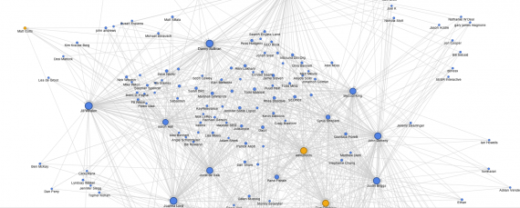
If you’re like me, you probably thought that this kind of Network Graph visualization would be great for visualizing social media data. It is. Here I pulled some Twitter data from some of the big names in the SEO industry to see who is following who.
A Few Things To Consider
This is barely scratching the surface of what Fusion Tables can do. Since this is “Experimental” also don’t expect things to run smoothly. This feature could also disappear over night (although I hope it doesn't). Believe me, there is A LOT more that can be done with Fusion Tables and this is a great push by Google to help make data less intimidating.
Furthermore, I'm very interested to hear your ideas. How will you use Fusion Tables? What other tools do you use for quick visualizations?

