Disclaimer: I am not an SEO dude. I dont have the same link building chops as Old Man Suarez, nor the architecture savvy of Senor Snyder. However, I am well versed in the timeless art of PPC and like to think I know a thing or two about the intertubez.
So picture this: After months of hard work, youve got top rankings for some of your keywords (bravo SEOs!) and want to write some content to expand your reach into the long tail. More than likely, you would head over to Google Suggest/Promediacorps Suggester/Soovle or any other tool of choice and get some ideas for keyword variations youd like to rank for. Then, you drop these variations into your traffic estimator of choice and boom; youve got keywords with volume. Finally, you would start developing content thats designed to rank well, attract links and (above all) customers. You know the content development phase is going to take a long time, but eventually youll get those rankings and sweet, glorious traffic!
The fatal flaw in the (commonly used) method above is that you have no real idea how that traffic is going to convert. Youve got about 900 possible long tail versions of that keyword that youd love to rank for. But, can you really write content for all of those 900 keywords? Which keyword do you choose if there are 10 variations, all with the same search volume?
The answer to all of these questions lay within a gigantic dataset that your resident PPC Professional already has Search Query reports! For those of you that dont know, a search query report is a tool offered by most major search engines and contains key metrics (impressions, clicks, cost, conversions) broken down by the exact query searched. That means you can find the exact keyword variations that havent just driven traffic but (drumroll please) CONVERTED!
Pretty valuable stuff from a PPC perspective, but heres a trick that Wil and I came up with to help the SEOs of the world to write content with keywords that will not only generate traffic volume, but are most likely to drive conversions as well.
Note: The guide below assumes you have excel 2007 or later. If you need old school instructions, leave a comment and Ill write a guide for other versions.
1: Pick your lead horse
The first step is picking the lead keyword for which youll be optimizing the page. In this case, were going after Help Desk Software, which has 6,600 monthly searches.
2: Pull your SQ report
Navigate to the keyword tab of your AdWords interface and click on See Search terms All. You could filter now, but I prefer to toy with the excel sheet itself once we have all the data so we dont miss anything. Make sure to pull it for a long time period in this instance Im going for the last 14 months but the more data you have, the better.
3: Clean the data.
After youve exported the data into Excel, we need make it easier to work with. First, eliminate all of the columns you dont need. Eliminate EVERY column except for Clicks, Impressions and Conversions (well need conversion rate as well, but dont worry about that now). If you really want, you can keep cost in there, but for this purpose its not necessary.
4: Organize the data
Hope youve got plenty of RAM. Depending on how much you spend and how large the account is, youll likely have a TON of data. In this example I ended up with approximately 18,000 rows, many of which are duplicates (a single query could be sourced from several different campaigns/countries/keywords). This is where our good friends Pivot Tables and Patience come into play. First, create a pivot table with the entire Search Query report included.
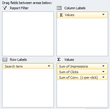
Add Search Term as the row label. Add Impressions, Clicks & Conversions as the values. This will create a dynamic chart that totals all the duplicates for you.

Ta-da we have totals! (Note: you could use Sub-totals for this, but I find that takes a bit longer and is kind of annoying). Copy the entire pivot table into a new sheet (copy paste special paste values) so you can...
5: Play with the data
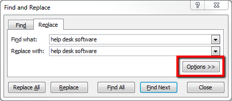
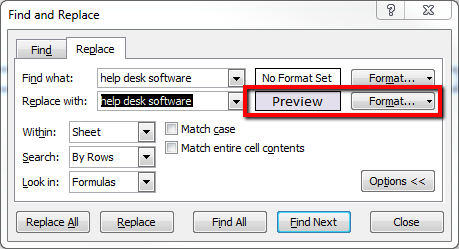
Theres a ton of great data, but in this case were only concerned with tails that contain the phrase help desk software. On the excel sheet execute a find-and-replace for help desk software, only changing the color.

Sort the cells by color (custom sort sort on cell color your color on top) and voilà, youve got all the help desk software queries isolated. Id advise you to set a threshold from here on out (i.e. remove any queries with less than 10 conversions) so youre only looking at significant data. Add in and calculate a conversion rate column, and sort the list in descending order. Depending on how big your initial data set was, you should have a nice little list of tail terms to weave into content.
Its not a bad idea to run these through a traffic estimator just to make sure they get some traffic. In this case, all but 2 keywords showed up in the estimator.
6: Write!
So what do you think? Will you be using query data to help with your content efforts?
For a few more PPC-to-SEO ideas, check out Our Powers Combined Part 1, written by Ryan Fontana and myself!


