Ah, the digital world. It’s a blessing and a curse. Every day, new technology emerges from Silicon Valley, 15 year old kids’ basements, and Fortune 500 companies. And while these technologies can certainly take our work to new heights, I’m here to advocate that we use them in tandem with a very simple, very powerful tool: the pencil.
Who am I, you ask? Kristin Bigness here, (aka Bigs, Biggie, Bignazz, etc), writing from the small but mighty creative team at SEER. Any one of my fellow designers can reminisce with me about countless hours designing by hand for the first year or two of art school. Life drawing with strange models; trying to paint the perfect 10-square sequence from white to black with gouache paint; staying up late to complete 50 thumbnail sketches before the next class. But why so much manual labor? And how can this help digital marketers? I’m here to share a few reasons why the pencil is so powerful—for designers and marketers alike.
1. It's where the thinking happens.
My first art director taught me enough to write an unlimited number of blog posts, but one thing in particular that always stuck with me was her tapping a pencil against a piece of paper and saying, "This is where the thinking happens." And it’s true. By paring down the tools that are available to you, you concentrate on the challenge at hand. You allow yourself to put down concepts in their purest forms. You draw a square on a piece of paper and it’s a square. But when you fire up the computer and draw a square, the minutiae abounds. Does it have a stroke around it? Does it have a shadow or level of transparency? None of that matters until you have the idea.
I can’t help but think of Paula Scher when discussing the pencil sketch. For those unfamiliar, Scher is a graphic design icon (and a Tyler School of Art alum—holla!). In a 2013 interview, she was asked if it’s important for graphic designers to be able to draw. She simply said, “It’s important for a graphic designer to be able to see. It’s also important to be able to make a sketch of what you see.”
Which brings us to the legendary Citibank logo story. Whether you’ve heard this one before or not, it’s a great example of the power of the pencil. In Spring of 1998, Citi announced a merger with Travelers Insurance. At the time, it was the largest merger in the world and the brands needed to be unified to reflect that. Legend has it that Paula Scher drew this sketch on a napkin during a client meeting:
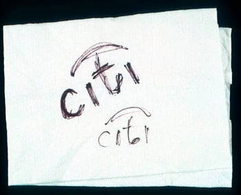
What she saw was the “t”. The “t” is not only the first letter in “Travelers”, but it also bears a serendipitous resemblance to an umbrella handle. Add an arc above the “t”, and you’ve got an incredibly elegant solution to bringing two brands together. See the full evolution here.

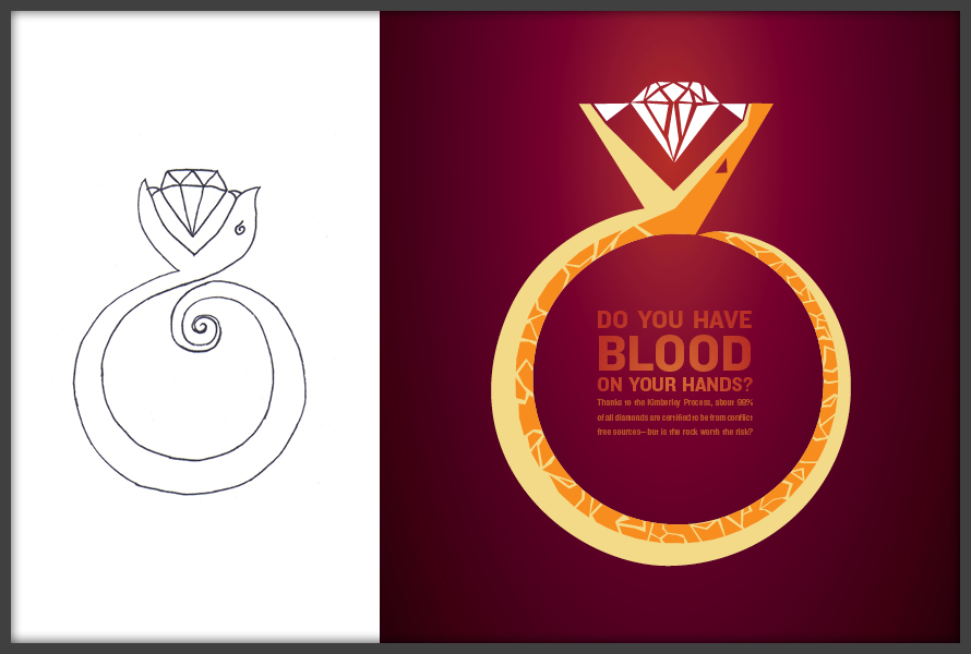
Well I’m no Paula Scher, but in the in spirit of putting my money where my mouth is, I’ll share a personal project of mine. While sketching, I saw a correlation between the menacing, open jaws of a snake and the setting for an engagement ring. The sketch came to life in the form of a PSA poster about blood diamonds.
As a marketer, you’re likely not rebranding companies or designing collateral, but you may need to work with designers, or even communicate a process or campaign during a pitch. Whether your final thoughts are going into a PowerPoint, Keynote, or the like, challenge yourself to sketch your thinking first. Disregard the myriad effects PowerPoint thrusts upon you, and “see” the ideas come to life.
2. It yields more possibilities in less time.
Remember all the ways we could customize the square in our sketch? They take time. Once Paula had solved the idea of the Citibank logo, it didn’t end there. It went into a phase where color, shape, typography, letter spacing, and many more nuances were ironed out. The idea was solid and worth pursuing down that road—but the first idea is often not the best solution.
Instead of diving fully into your first idea, sketching allows you to put down as many ideas as possible in less time. Let the ideas flow, don’t get too precious with any one concept, and you’ll find that you’re more productive. This applies to both visual pieces and creative concepts in general. For instance, diving in too fully to a design is like allowing the first idea to dominate a brainstorm. Use the pencil to keep ideas flowing. Designers—when in doubt, keep sketching! Marketers—consider conducting a brainwriting session vs a brainstorm to get more options on the table in less time.
Options allow us to explore, pick and choose. Options allow us to compare what’s working and what’s not, and saves us from pursuing an idea that doesn’t have legs. I often share initial sketches with clients so they can see the options and the thinking. They can react to the purest form of the idea, again without spending too much time getting into details. They become part of a more iterative, collaborative process—which brings me to my next point.
3. It's a great communication tool.
Marketers, designers, account executives—we’re all communicators. Why not add another tool to your belt? Three types of learning styles are often cited in education—Auditory, Visual, and Kinesthetic, but the fact of the matter is that most of us learn through a combination of these styles, and some concepts are meant to be visualized.
Hint: Keep some copy paper and a pencil at your desk. If you don’t have a scanner hooked up, just snap a quick shot with your smartphone and email it to yourself or your colleagues to communicate your next big idea.
4. It's a roadmap.
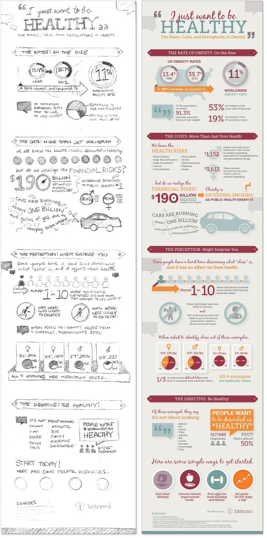
Remember in school when your English teacher made you create an outline for your paper prior to writing? For more complicated pieces, the sketch does the same. Your sketch should account for every piece of the puzzle. How important is each element, where will it go, and how will it react with the rest of the piece? How are you telling the story? For marketers, are you sketching out the slides of your pitch deck ahead of time so you know you’re accounting for each part of the story? If not, you may want to give it a try. It helps solidify your thinking, ensures you don’t miss a major component, and makes diving in later and seeing it evolve into a finished product that much more gratifying. The sketch below for BistroMD did wonders to guide the process. See the full post and graphic here.
5. Anyone can do it.
I can’t tell you how many times my marketing colleagues have apologized for “bad art” when showing me sketches. No apologies are needed, and on the contrary—your design counterparts and clients will likely thank you. They may suggest tweaks or even a completely different approach, but the important thing is that you’ve shared your vision and have leveraged a powerful collaboration technique.
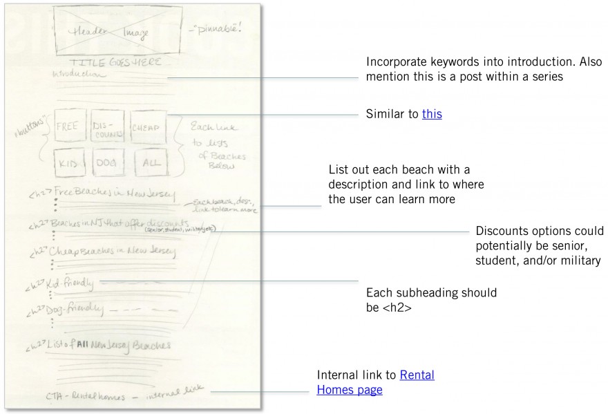
In fact, I have one more example for you, this time from one of our Team Leads, Emma Still. Historically, our team guided content for one client's blog by providing traditional keyword research without setting detailed expectations for how the posts should look. This time around, Emma decided to create a summer series and test out creating pencil sketches detailing various sections, visuals, etc. in addition to traditional keyword research for the posts. The results? The summer series blog is the second-most trafficked post in the blog's history.

It all started with this:
So marketers, throw your inhibitions to the wind! If you have a vision, sketch it!
Until next time, this is B.I.G signing off.


