Welcome to The Definitive Guide to Analysis Workspace for Adobe Analytics, here's what we'll be covering in the post below!
Table of Contents
- The Mystery of Digital Analytics
- The Role of Analysis Workspace for Adobe
- Analysis Workspace Landing Page
- The Basics of Analysis Workspace
- 20 Analysis Workspace Tips
- Date Range Comparisons & Rolling Dates
- Duplicate Visualizations
- Segment Comparison Tool
- Group Drops
- Right-Click Options
- Freeze Visualizations
- Text Descriptions
- Summary Change & Summary Number
- Hide Panels & Visualizations
- Undo & Redo Buttons
- Hot Keys
- Copy and Paste
- Share a Link to Your Project
- Filter Rules
- Item Preview & Exploration
- Curate Project Data
- Reset Column Widths
- Anomaly Detection
- Visualization Switch
- Fallout & Flow Reports
- Feature Requests and Next Steps
The Mystery of Digital Analytics
Digital analytics can be a mysterious, confusing, and complicated space, and “when you really start to dig into data, most people don’t even know what’s possible.” (Source: Ben Gaines, Adobe Analytics Summit 2017, Using Analysis Workspace to tell powerful customer journey stories)
Luckily, with the introduction of tools like Adobe Analysis Workspace (and Google’s counterpart - Google Data Studio), the view of what’s possible with your data is starting to take shape through the fog.

The Role of Analysis Workspace for Adobe
So, what role does Adobe Analysis Workspace play for Adobe, and why should you use it? Here are the key characteristics:
- Analysis Workspace serves as both an analysis and data visualization tool, allowing you to quickly pull the data you need, and at the same time serve the role as a client-facing report.
- Analysis Workspace makes it inherently easier to pull data then in the main Adobe report interface, with almost limitless breakdowns and flexibility with dimensions, metrics, segments, and date ranges.
- Analysis Workspace can be useful for one-time data pulls, and at the same time be useful for recurring tasks with preset date ranges (more on this later).
- Analysis Workspace mirrors many of the tasks that Adobe Report Builder can do, but directly in the Adobe interface, instead of nested within Microsoft Excel.
Sounds like something you might be interested in? Here’s where you can find Analysis Workspace in Adobe (directly on the top navigation bar of Adobe). If you do not see this option, you may need to get your user settings updated to have access to Analysis Workspace:
Analysis Workspace Landing Page

What can you do once you’ve reached this area? Let’s break it down:
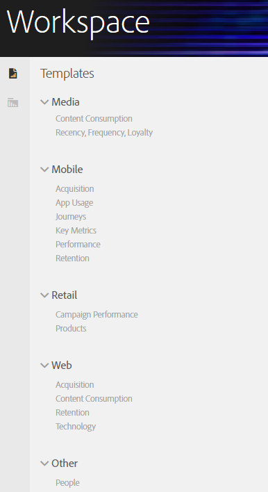
- Choose Adobe preset workspace templates: Don’t want to create your own Analysis Workspace set-up? Choose from one of Adobe’s preset templates to automatically apply their set-up to your data. This is available on the left hand side of the Workspace landing page, as shown below:
- Create or interact with current workspace set-ups: You can click Create New Project to create a new Analysis Workspace project, manage current workspace projects (sharing, tagging, grouping, etc.), set the Analysis Workspace area as your Adobe landing page (if you find yourself using it), and view tutorials.

Let’s create a new project and get into the heart of Analysis Workspace!
The Basics of Analysis Workspace
The most important thing to understand about Adobe Analysis Workspace is to how to navigate and setup items. So, let’s show you how!
Left Sidebar Navigation and Top Menu
Analysis Workspace’s left sidebar provides the majority of navigation you’ll need in the tool. It breaks into three major areas (that work from largest to smallest in terms of set-up), as displayed below:
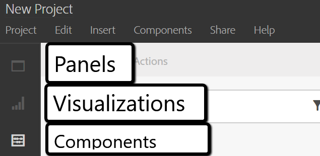
Let’s take each, one at a time:
- Panels: Panels are the foundation of any analysis workspace set-up, and your choices are:
- Blank Panel - a complete blank slate to add any data you want.
- Freeform - everything Blank Panel has, but with more comparison opportunities
- Segment Comparison - choose two segments to match and automatically find overlapping characteristics
Each panel allows you to set-up a date range and segments for the entire panel. These date ranges and segments will apply to all visualizations within the panel, which is our next area:
- Visualizations: Visualizations are the individual areas that make up a panel, and are made with individual components. Your available visualization types are:
- Freeform Table
- Cohort Table
- Fallout
- Flow
- Area
- Area Stacked
- Bar
- Bar Stacked
- Bullet
- Donut
- Histogram
- Horizontal Bar
- Horizontal Bar Stacked
- Line
- Scatter
- Summary Change
- Summary Number
- Text
- Treemap
- Venn
For pure data pulling, the most foundational visualization is the freeform table, which we will breakdown individually later in the post. Visualizations that are more visual can inherently feed off of freeform tables for their information, which we will also touch on.
- Components: Components are your most granular Analysis Workspace choice, but they can both impact individual visualizations, and influence entire panels as a whole. More on this later. Let’s see what components you have to start:
- Dimensions
- Metrics
- Segments
- Time
This is where the real beauty of Analysis Workspace comes in: these components can be manipulated in nearly limitless ways to visualize your data. Want to have 4 layers of dimensions, 5 metrics each with nested segments, and set-up to do month-over-month and year-over-year time comparisons? Analysis Workspace affords you this flexibility.
To show you just how flexible this is, let’s break down the foundational visualization of Analysis Workspace, the freeform table.
The Freeform Table
This area is so foundational to Analysis Workspace that any new project comes with a blank freeform table already set. See below:
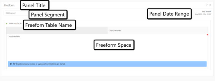
Within the freeform table, you can drop in dimensions, metrics, segments, and date ranges (your components), by dragging and dropping from the left-hand sidebar into table. Let’s show what this looks like if I drop in mobile device type to the row, and visits to the column:
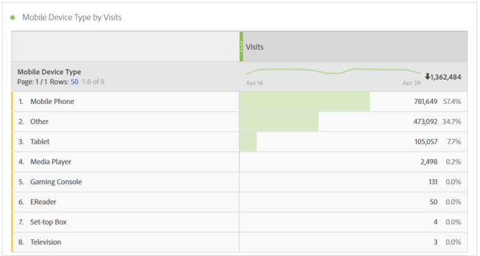
Now, I can see each device type by their visit volume over the specific time period. But, let’s say I only care about organic traffic. Here’s where we can layer a segment on top of visits to get more granular:
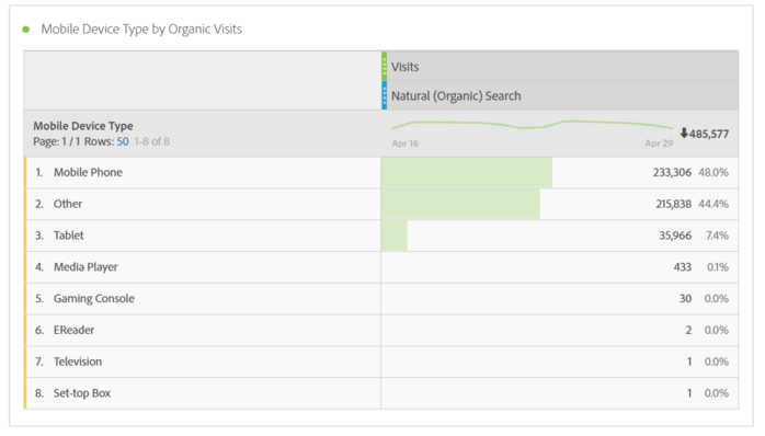
Let’s not stop there however. What if I want to see what mobile organic regions are the most popular? Let’s drop region onto the Mobile Phone breakdown:
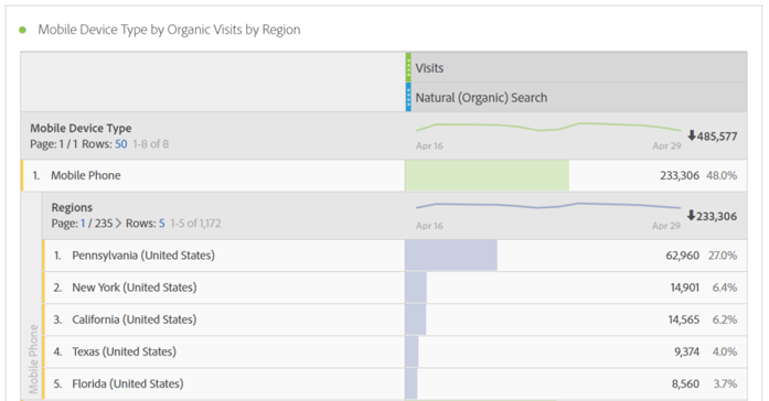
Great, so we know Pennsylvania organic mobile traffic is huge now, but let’s find out what mobile devices they are using, by adding the Mobile Device dimension:
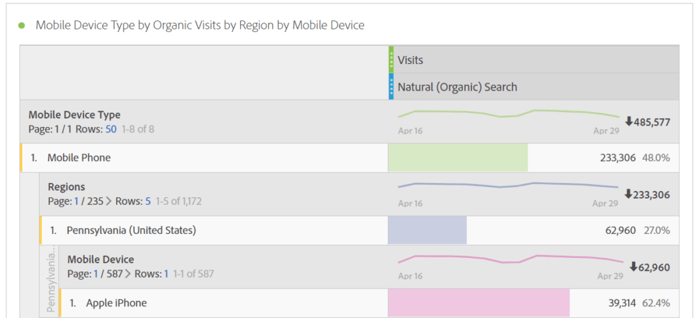
So now, we know Pennsylvania iPhone users are nearly 17% of all mobile traffic. But, let’s add bounce rate as another metric to see how they are engaging.
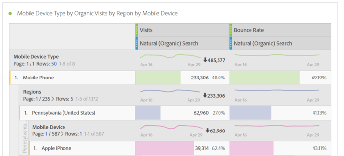
Now, we know that Pennsylvania iPhone users leave at a lower rate than overall mobile phone users. I’m sure you can see how workspace can easily give you action items and recommendations based on the data you find!
What’s so unique and special about the freeform table is the possibilities are truly endless. You can drill down, filter, segment, and slice and dice the data to your heart’s content. We’ll have even more tips for the freeform table as we continue.
So, now that you have a basic grasp as to how a freeform table work, let’s get into the nitty gritty of Analysis Workspace with intermediate and advanced tips.
20 Analysis Workspace Tips
Analysis Workspace has a ton of cool and useful features, but unfortunately, many of them are hidden deep in the tool. Let’s break down some tips based on skill level, and see how each is useful:
1 - Date Range Comparisons & Rolling Dates
Analysis Workspace can be useful for ad-hoc (one-time) pulls, but part of it’s charm comes from being able to compare data over time. The first way to do this is to use Adobe’s rolling date presets. This can be accessed from the panel date range dropdown, as shown below:
Click on the current date range.

Click on the date range dropdown.
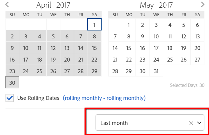
Select your preset, and voila! This could be useful for monthly, weekly, quarterly, yearly data, or even custom date ranges you can create on your own (under Components > New Date Range in Workspace’s navigation).
You can also now right click on items in freeform tables, and automatically generate date comparisons. Want to have month-over-month or year-over-year data generated automatically? See below:
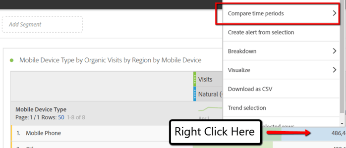
Analysis Workspace also gives you percent change for area, that automatically applies as continue to breakdown items (super useful in my experience)
Skill Level: Intermediate to Advanced
Useful for: Recurring analysis and visualizations
2 - Duplicate Visualizations
This one is simple. If you right click on a visualization itself, in near the text, you get the option to duplicate the visualization. This is useful if you build out complex tables and need to only switch out a segment to get that data you need. No need to rebuild the table from scratch!

This can also be done for other visualization (line, bar, etc.).
Skill Level: Beginner
Useful for: People who don’t like spending time duplicating their work manually!
3 - Segment Comparison Tool
Want to see common characteristics between two segments, simply create a segment comparison panel, and add in your segments to compare, as shown below (Adobe even gives you estimated time for the comparison once you hit Run):
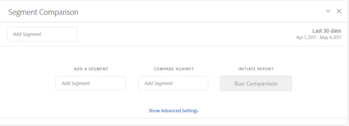
Let’s do it for mobile and organic users, since we’ve already dug into that a bit:
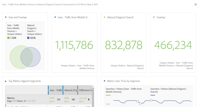
With the touch of a single button, Adobe generates the relevant visualizations to show how these segments overlap. It is truly that easy.
Skill Level: Beginner
Useful for: Analysis where you want to see how users in different groups interact (which could be argued should be the basis of most analysis)
4 - Group Drops
Want to add in multiple dimensions, metrics, segments, or date ranges into a single area. You can do this by highlight each area of the left-sidebar and dragging them over at once:
By selecting both at once, you can drop this onto a dimension, to see how it breaks down by both social and organic traffic at once:
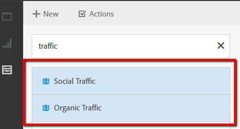
Here it is in action:
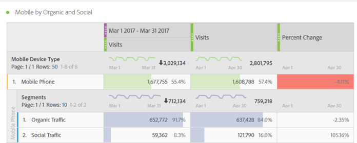
Now, we know that social’s mobile traffic is still doing strong month-over-month, despite the overall drop (largely influenced from organic).
This can also be useful for grouping metrics together for quick analysis (say you know you want to see visits, pageviews and bounce rate for your table).
Skill Level: Beginner
Useful for: Saving you time from dragging and dropping information.
5 - Right-Click Options
Savvy readers likely caught this with the date comparison option, but you can right click in freeform tables (and do so much more then date comparisons!). What can you do with this?
- Create an alert from your selection
- Breakdown (essentially add another dimension without dragging it)
- Visualize (create a visualization from the table automatically)
- Download the data as CSV
- Create a Segment from the Selection
- Show Only the Rows Selected
- Much more!
Right click away!
Skill Level: Beginner
Useful for: Quickly modifying freeform table information.
6 - Freeze Visualizations
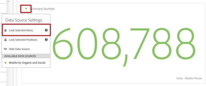
When you create a visualization from a freeform table (i.e. select the data in the table, pick a visualization, drag onto the panel), that visualization will then be reliant on the selection, and will change if you move it. To freeze the visualization, click on the top-left corner circle, and hit lock, see below:
Skill Level: Beginner
Useful for: Ensuring your data visualizations don’t get changed accidentally.
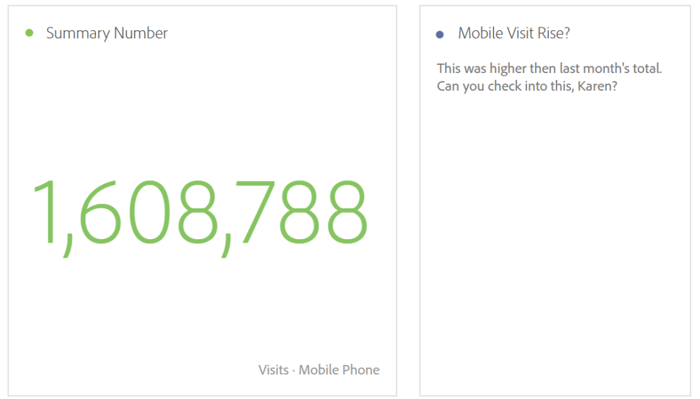
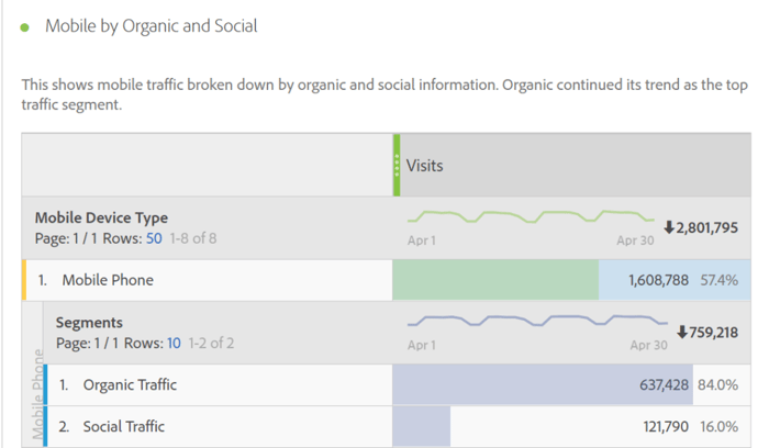
7 - Text Descriptions
In a freeform table, or in a Text visualization, you can add text for a variety of reasons:
- Describing methodology for why the data is shown the way it is
- Adding analysis, action items, recommendations, a projected impact of the change
- Adding context next to visualizations
Let’s see examples below:
Text Visualization Example
Right Click On Freeform Table Example
Skill Level: Beginner
Useful for: Adding context for visualizations, could even set-up a whole analysis with recommends just in Workspace.
8 - Summary Change & Summary Number
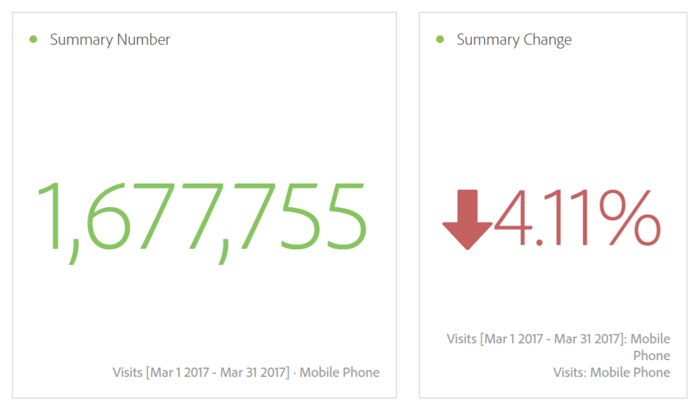
Sometimes freeform tables will be best, or other visualizations, but summary number and summary change can highlight overall trends easily. Another example for mobile, generated by highlighting the mobile total (in the freeform table), and then dragging over a the summary number and summary change visualizations:
Skill Level: Intermediate (only with having to freeze visualizations, and recommend hiding those freeform references)
Useful for: Adding context for visualizations, could even set-up a whole analysis with recommends just in Workspace.
9 - Hide Panels & Visualizations
Speaking of hiding these references, you can easily hide panels or visualizations. This is especially useful for referencing visualizations, or if you have a massive analysis workspace set-up, speeding up overall load time. This appears upon hover on visualizations or panels (you can also delete, a much more permanent change):

Skill Level: Beginner
Useful for: Speeding up analysis workspace, decluttering the interface
10 - Undo & Redo Buttons
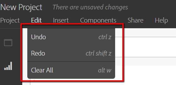
Made a mistake in Workspace that messed up all of your data? No problem! Simply click on Edit on the top-left navigation and click undo or redo (or use the hotkey options, more on that next):
Skill Level: Beginner
Useful for: People who make mistakes (which psst...is everyone :) )
11 - Hotkeys
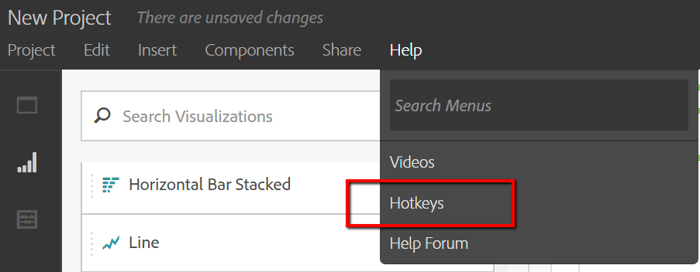
As shown in the Edit drop-down shown above, you can use hotkeys for most Analysis Workspace options. Simply click on Help and find the full list here:
Skill Level: Advanced
Useful for: All the Adobe power users out there!
12 - Copy and Paste
A really simple one, but you can copy and paste data from freeform tables. I’ve found this useful for:
- Opening URLs that you are analyzing to easily reference and put context to the data
- Dropping a portion of data into Excel for quick calculations
Skill Level: Beginner
Useful for: People that want to take Workspace data out of Workspace
13 - Project Link
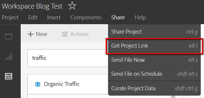
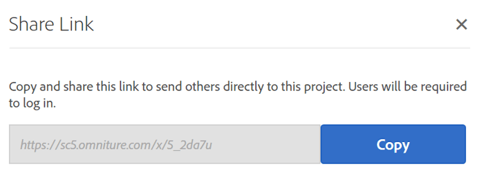
For any collaborative Workspace setup, you can create a quick link that users will be able to access (direct links to the Workspace URL do not work). It will prompt them to login, and then take them directly to the Workspace itself:
Skill Level: Beginner
Useful for: For those creating collaborative workspace tools
14 - Filter Rules
If you thought freeform tables could not be flexible enough, you can also filter them based on criteria. Let’s show some examples here with regional data:

Let’s say I only wanted to see Colombia regions. By clicking on the filter, and entering this below, I get the below results:
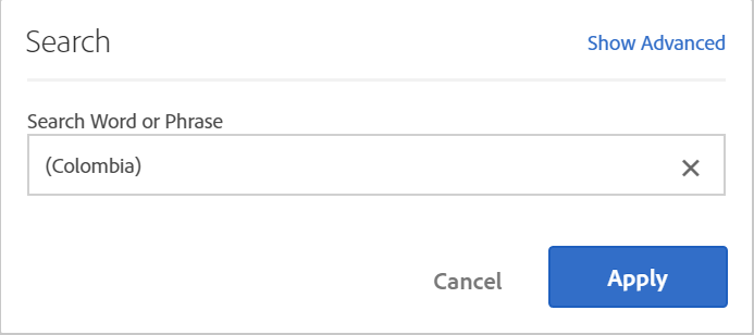
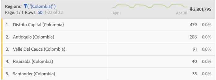
By clicking “Show Advanced” in the initial search, you can combine filters, so, you could specify only Colombia cities with “Santander”
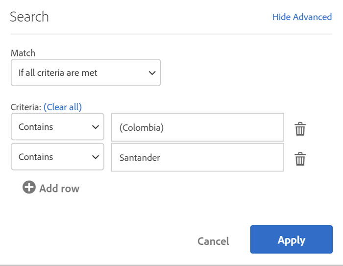

You might have noticed, this filter can change from contains to does not contain, and at the high level, you can match “If all criteria are met” or “If any criteria are met”. This logic can get complex quick, so be sure to spot check your set-ups. If you find notable trends with filters, throw them into a segment for easier analysis!
Skill Level: Intermediate
Useful for: Drilling down further on segments and gaining further insights
15 - Item Preview & Exploration
Want a preview of what your data will look like before you drop it in. Simply hit the item preview button and you get a pop-up of what you’ll see:
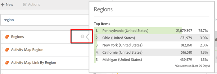
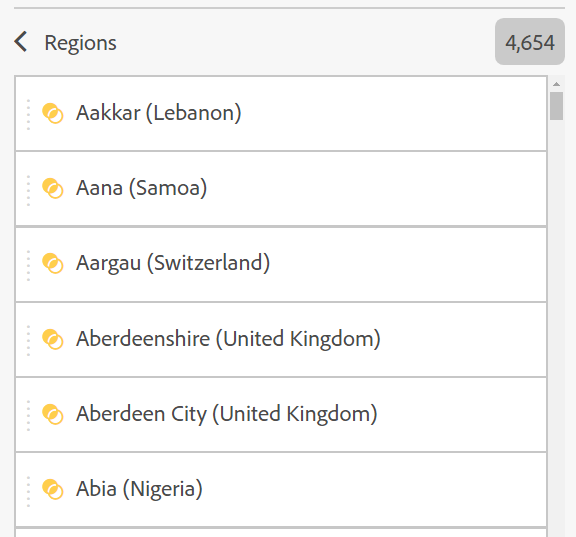
Next to this preview item, if you click the arrow, you can see all items that fall under this:
Skill Level: Beginner
Useful for: Seeing data before you adjust items in Workspace directly.
16 - Curate Project Data
Working with someone that is less familiar with your Adobe setup, but they still want to explore workspace? With curating project data, you can choose the metrics, dimensions, segments, and date ranges that they have to explore, cutting down potentially gigantic scope of available options (could easily have 200+ dimensions, 100+ metrics, more segments/date ranges).
So, how do you do this? Once you have the items you want in your project, hit Share > Curate Project Data on the top-left nav menu. See below:
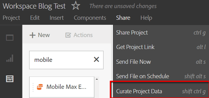
Upon this click, Workspace will ask you to confirm the components that you are curating:

Hit Done, and then under the component search, you have those options to use:
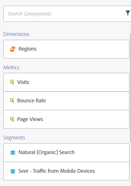
Skill Level: Beginner
Useful for: Sharing Workspace data with those that are less familiar with your Adobe setup
17 - Reset Column Widths
As you begin to add on more dimensions and metrics, your columns sizes with inevitably shift, and could get really out of order if you are looking for say, a full URL. Want to restore your original column widths? Adobe has built that into right click functionality:
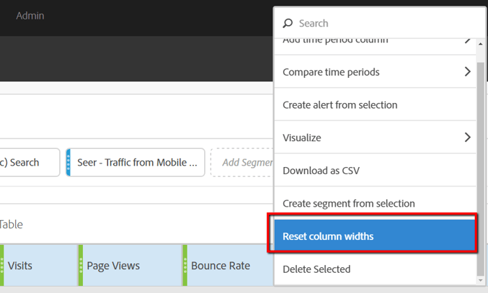
One click, and bam, original column widths are restored.
Skill Level: Beginner
Useful for: Anyone who is adding in a ton of metrics or dimensions into freeform tables.
18 - Anomaly Detection
Looking at a freeform table broken out by date ranges, and see strange marks on your metrics?

This is Adobe’s Anomaly Detection service, which automatically highlights outliers in your data, which uses advanced statistical methods you can read further about here. Even if you don’t understand then ins and outs of how this happens, the important point is it does some of your work for you! Hover over an individual instance, and it will show you why it is showing as an anomaly:

You would see something such as: Anomaly Detected - 3% Above Expected. This will also appear on most other visuals, such as with the dots on this line graph:
Skill Level: Beginner
Useful for: Anyone who is adding in a ton of metrics or dimensions into freeform tables.
19 - Visualization Switch
Created a line graph and realized you would rather have a bar or a column visualization? No need to recreate the visualization from scratch. Simply right click the gear icon on the upper-right hand portion of the visualization (appears on hover), and click the dropdown to switch the visualization:
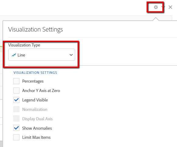
Skill Level: Beginner
Useful for: Indecisive visualization creators :)
20 - Fallout & Flow Reports
This last one is a doozy, so much so, that these two visualization deserve a break out of their own.
Fallout Report
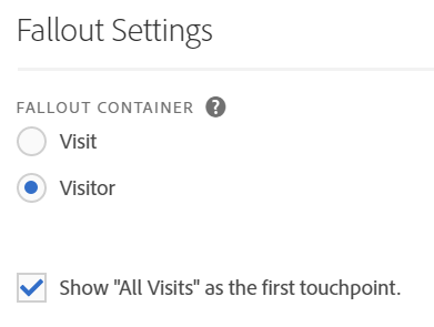
Create your own custom look of how visitors progressed through your site, using segments, dimensions, and metrics as touchpoints.

Fallout settings allow you to start with either Visitor or Visits are your metric base, and give you the option of starting with all visits/visitors as the primary start point (use the previously mentioned top-right hand gear icon):
Flow Report
If you are looking to compare a more pathing aspect in Workspace, Flow is the report for you. Upon dragging in the visualization, you are prompted with entering an Entry, Standard, or Exit Touch Point:

If I drop in Mobile Device (which lists out the actual model of the mobile device), I get this view:
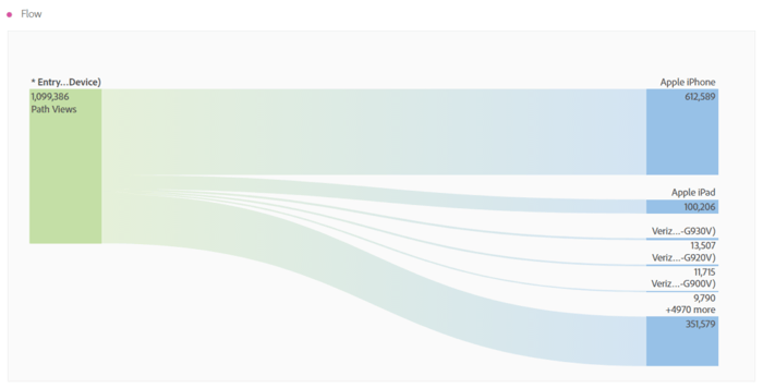
You can easily see that iPhones and iPad dominate mobile devices, and by hovering over each area, you can see the percentage impact. By clicking on a path, I can see further details, such as drilling down to the nearly 5,000 additional mobile device options at the bottom.
This report can be created for viewing entry page and page information, even with segments applied at the panel level.
This area is also based with the same option of Visit and Visitor container options as the Fallout report.
Skill Level: Advanced
Useful for: Visualizing how users progress through your site over time.
Feature Requests and Next Steps
Despite all these amazing features, Workspace could (and likely will) have many new features appear in the future. A few I’d like to see:
- The ability to pull Analysis Workspace set-ups into Adobe Report Builder Excel automated pulls.
- Greater shareability with users that are less familiar with Adobe, with users able to see reports not even logged into Adobe.
- Increased visualization options: as Adobe’s Sensei AI technology is further mixed in with data, I can’t wait to see what cool and automated visualization options they come up with.
As you explore Analysis Workspace, let me know what features you would like to see as well. Also leave comments on how Analysis Workspace has helped you with Adobe data exploration. What questions do you still have? How has Workspace helped your Adobe data exploration? Drop Adobe a line for feature requests and questions here.
Now, go forth and explore! The data awaits, you now know what is possible, and the fog has cleared.

