Social media is undoubtedly one of the best marketing tools to connect with existing customers and introduce brands to new users.
With US social media advertisers spending nearly $67 billion dollars in 2022, the paid social media landscape has become increasingly saturated and ever more complicated since the implications of iOS14 and the cookieless future of the digital world.
Creative remains one of the best vehicles for competing with an oversaturated market. “Ad relevance” is also a key component leveraged in Social Media algorithms which impacts costs.
 Source: Nielsen Catalina Solutions
This guide will provide you with best practices for designing high impact ad creative that drives better results across devices and platforms.
Paid Social Creative Best Practices
Know Your Audience
Users are more likely to respond to an ad if it reflects their background, interests, or pain points.
Create user personas to better understand the type of content your customer would like to see. This step is an essential part of developing your creative strategy.
Align Your Creative With Your Conversion Funnel
As marketers, we often talk about the importance of a full-funnel strategy, it’s important we don’t neglect to transfer that logic over to our creative approach. Context is crucial when thinking about what users see at each stage of the funnel.
The following explains the funnel the best and gives us insights into the kind of content we should be sharing at each stage of the funnel:
- Top-of-the-funnel/Awareness: Help generate interest in a product or service. Increasing brand awareness is about communicating what makes your business valuable.
- Middle-of-the-fully/Consideration: Gets people to think about your business as a solution to their needs and seek more information.
- Bottom-of-the-funnel/Conversion: Encourage people interested in your business to buy or use your product or service
Taking the time to understand what you’re trying to accomplish at each stage of the funnel is important and helps break down the kind of creative we should generate for each stage.
Put it into practice:
Let’s take, for example, a business that sells hot tubs and is advertising on Meta. We can take our funnel definition above and translate that into the following creative strategy:
1. Top-of-the-funnel/Awareness
- Lifestyle images and videos of people using the swim spa's
- Communicates innovative systems that make their business valuable

Source: Meta Ad Library
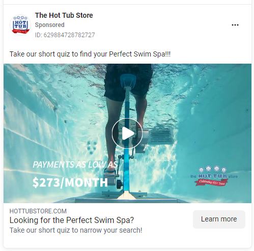
2. Middle-of-the-funnel/Consideration:
- Visually describes business as a solution displaying different functions and ways to utilize swim spa's
- Encourages users to take a quiz to push them further down the funnel through their purchase journey

Source: Meta Ad Library
💡 Pro Tip: Quizzes are a great way to understand more about your users and their interests. You use these insights to retarget your audiences with highly specific ads at the bottom of the funnel to increase conversion rates.
3. Bottom-of-the-funnel/Conversion:
- Discounts/Exclusive Product Offerings
- Encouraging audience to "Get offer" and complete the purchase journey

Source: Meta Ad Library
Optimize Creative for Mobile
Remember a time when browsing social media sites could only be done by desktop? Oh how times have changed! In 2022, social media was estimated to reach almost 4 billion users, only growing with mobile.
As professions, we know this, yet we continue to display creatives that aren’t suitable for a positive mobile experience. Here are some best practices for building great ads that won’t get scrolled past:
1. Embrace Video Content
Video is an effective vehicle for presenting your brand while quickly capturing users’ attention. According to Facebook, campaigns that implement video saw a 17% higher conversion lift vs. static images alone.
2. User Generated Content
User Generated Content ("UGC") is one of today's trending strategies for connecting with audiences using organic or paid testimonials. According to a Seer Paid Social Manager and TikTok influencer, voiceovers and narration create better user experience.
3. Account for Sound Off
It’s essential to take into consideration that not all users will have their sound on. To help convey your message when using video, add subtitles to your video using auto-captioning tools on wave or ads manager.
4. Three Second-Rule
The first few seconds of your video are crucial to introducing your brand and the product or service you’re offering. Show your brand or product at the beginning and end of your video, and use brand color and imagery throughout your video.
5. Account for Placements
Tailoring your creative for different placements is a vital part of your creative strategy. It’s important not to impede the quality of the user’s experience with unrefined cropping and ill-fitting specs.
5. Utilize Text Overlays
Stock images without visible CTA’s won’t capture the user’s attention while they’re scrolling the endless amounts of content on their feed.
Adding customized text overlays that highlight the benefits of your product or service helps elevate the look of your ad and solidify important user value props & call-to-actions. Although text overlays are always encouraged, it’s important to keep your call-to-actions concise and not too long so that your ads blend into the feed seamlessly with user-generated content.
Test! Test! Test!
At Seer, we use data-backed tests to inform our creative strategy and be more purposeful with our creative resources, and ad spend.
Testing new iterations of your top-performing creatives is an integral part of understanding what creative elements attract your customer the best and cut through the noise.
When testing new creative, consider the following:
- Consider what you already know to be true about your target audience and use data to inform these findings.
- Form a hypothesis. What do you want to know about this audience?
- Design your creatives separated into the different themes or concepts you’re trying to test.
- Set your target KPIs
- Launch & run your test.
- Analyze test results & impact. At the end of your test, was your hypothesis correct? Were the results significantly significant? If so, create iterations of your winning creative and start the process again.
💡 Put it into practice: Imagine your company sells organic baby food products. Based on previous audience research you know your customers resonate with imagery showcasing motherhood. You also have a hypothesis that mothers are interested in the contents of the food itself, and that drives their purchase decisions. To prove this theory, you create an A/B test vs product-specific ad creative highlighting ingredients and nutrition / health benefits.
Data-Driven Design
Sometimes improving performance is more than just tinkering with overlays and images and we aren't afraid to test going against best practices if they could be right for your audience! At Seer, we live at the intersection of data and creative and utilize tools like our custom-built Creative Fatigue Analysis, which helps determine when a creative refresh is needed or using Organic Search Query Data to identify gaps and opportunities to improve messaging.

We encourage you to think outside the box and use your existing data to expand your creative direction.
Looking for dedicated Paid Social or Creative & Design support?
Check out Seer's capabilities, work samples, etc. and get in touch.
Or take a look at some additional content for Platform specific ad types and best practices!
This post was originally written by Ricky Rodriguez and published on September 22, 2021.
This post has since been updated by Briana King-Kudhlande and republished on March 23, 2023

