We are all aware that Google is constantly testing new ideas for ads to improve user experience: more sitelinks, less sitelinks. One-line sitelinks, two-line sitelinks. Display URL in headline, description line 1 in the headline. Display URL below the headline, below the ad text. You get the idea. Most of these are out of our control, but you have some ability to increase your chances to be ‘opted in’ to some (e.g., ending your first description line in punctuation for extended headlines).
Well they’re at it again, and this time it’s for mobile devices. Everyone knows that mobile is blowing up faster than Ridiculously Photogenic Guy so it comes as no surprise that Google wants to create the best user experience there as well.
One of the most universal best practices for mobile is to be focused – short and sweet, to the point. User behavior is wildly different than desktops, and most aren’t wasting time researching products. They want actions… now. Which brings us to Google’s new mobile ad format.
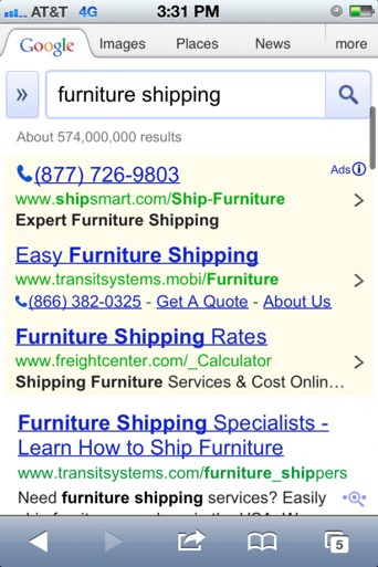
After performing a search on my phone, the new results hit me:

I thought to myself, when did they start displaying three paid listings? Then I noticed the ad text was missing in two of three. Let’s discuss the “missing” ad text.
“Missing” Ad Text
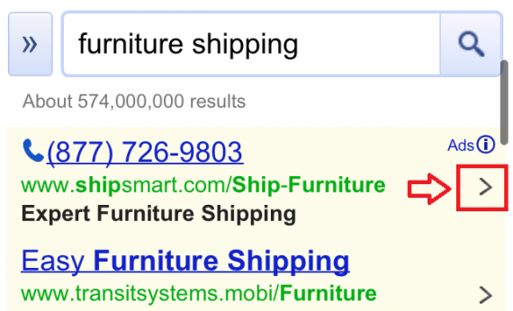
In our previous screenshot, the first ad is a call-only creative, the second is using ad extensions, while the third seems to be your typical ad although its text is cut off. However, not every ad has ad text (description lines 1 and 2). Now, Google is now displaying arrows next to each:

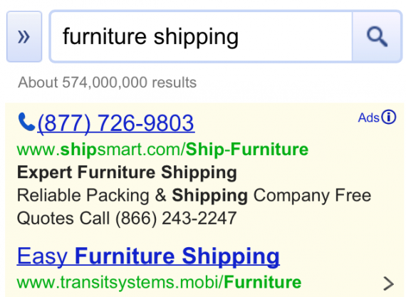
This will expand the ad to display the text upon clicking:

I believe this was likely implemented to allow for three paid ads without taking up more real estate, but that’s a whole other discussion. I want to focus on two items I discussed earlier – better user experience and being focused (i.e., goal-oriented).
With these new ads, there is no more weeding through value props or comparing discounts. These changes are forcing the advertiser to be ACTION-oriented. Call NOW. Get a quote NOW. I believe this is where Google is heading with mobile ads. Which leads us to...
How does this impact my mobile strategy?
First off, let’s not write off ad text completely - this is only a test and may not even roll out to all ads. But with this new ad format, you should be using extensions to your advantage and rethinking what extensions should be used. An extension that’s implemented in your desktop campaign may not be ideal for mobile devices so don’t start cloning all your ad extensions just yet.
Let’s take a closer look at the second ad in our example:

This advertiser is using both call & sitelink extensions. Not only are they using extensions, but using them in a way to place their goals in front of the user. A user searching furniture shipping could call or get a quote instantly by just clicking these links, unlike our unlucky fellow in the third position:


Not only is this unfortunate advertiser not capitalizing on ad extensions, but they also have their text cut off – text that someone likely spent hours developing and testing. Maybe even days.
My point: use action-oriented ad extensions. If Google plans to cut off your ad text, and place more emphasis on ad extensions, then capitalize on that. They are easy to set up, and provide the opportunity to convert in less clicks; sometimes as little as one click. Lastly, use them in a way to create a better user experience. Get your goals in front of your potential leads and start seeing more money NOW!
Have any ideas on how Google’s new ad format will affect your mobile strategy? Please share below.


