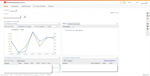
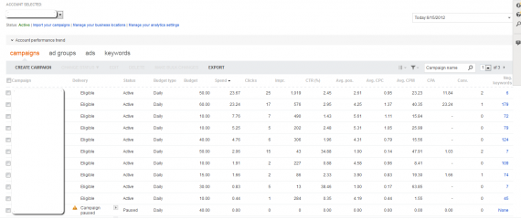
When I logged in to check on my accounts today, I got a nice little surprise – a belated birthday present, if you will. It was nothing overwhelming, but it was nice to see nonetheless. What was it? Oh, just a bit of cosmetic surgery applied to the Microsoft adCenter interface:

As I said, it's not a huge update, just a little facelift; which is great to see, because the old interface was looking and feeling a bit fatigued. While I haven't seen any official posts about the change, nor have I seen any new functionality added in, what I HAVE noticed is that I am able to navigate much more quickly. It's still not AdWords-quick, but the lag I usually experience hopping between tabs feels less. Placebo effect? Maybe. But I'll take it!

So the interface looks a lot prettier now, and MAY navigate more quickly, but some underlying problems still exist. Changing the date range still breaks my filtering, Conversion Rate still isn't available as a column in the Campaigns tab, and it's still not as quick as AdWords. But it's really nice to see Microsoft making the effort to update its ad platform offering through these cosmetic upgrades and other projects they have in the works.
What do you think of the new look of adCenter? Have you noticed any undocumented changes that came along with it? Let me know in a comment!

