Google’s Accelerated Mobile Pages (AMP) project is buzzing. Since the launch of universal search in 2007, Google has continued to develop SERP enhancements that create a more user-friendly experience. AMP is certainly a part of this mission, as it allows users to read news articles instantly on their mobile devices. AMP results now rank above the typical news-related links found in the SERPs.
If you are looking for a breakdown of all things AMP, check out the official AMP documentation and Moz’s most recent edition of Whiteboard Friday for a very simple, detailed explanation.
Within this post, I’ll dive into the next steps for AMP - such as its’ impact on user experience, reasons why your brand may be a good fit for AMP, and how to implement it on your own website. The Seer team is just starting to test our own accelerated mobile pages via our blog, so make sure to stay tuned over the next week for the results.
If you’re not already doing so, read this in the AMP version!
Why You Need to Try AMP Out For Yourself
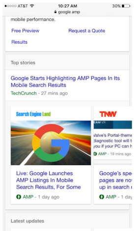
If you haven’t engaged with an AMP carousel yet - you need to try it out! It’s simple. First pull up Google on your mobile device, and then search for a current topic in the news. In the example below, we searched for “google amp” from a mobile device.
Here’s what the AMP carousel looked like last Friday, February 28th for this query:

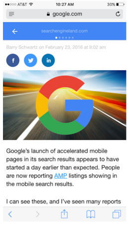
When we clicked into the first result, an article published by Search Engine Land, it loaded instantly - all without leaving Google. This is a pretty big deal - AMP project was expected to decrease load times. But when you actually try it out, load does not seem delayed at all.

Within the AMP carousel, users can quickly swipe between articles to quickly read different articles to find the information that they are looking for.
Just think about that for a second. A few days ago, when looking for news articles on your mobile it would have been a complete drag. But now, you can quickly scan up to 5 articles, find what you are looking for faster than ever before, and gain more value from your search in less time.
It’s slightly concerning for publishers that Google is basically taking full control of news publishing. (Source: Nieman Lab) But one thing is certain: Google followed through with their promise to deliver useful information, that can be easily accessed by anyone.
Who should be using AMP?
First and foremost, the AMP Project was created for news and media publishers. Currently, these types of websites have the biggest opportunity (and risk) due to AMP because it will certainly change the way users interact with new articles in mobile SERPs.
In an article from Re/code, Richard Gringas, Head of Google News, says that any website can use AMP (Source: Re/code). Large ecommerce sites have been invited to use the platform, which indicates that AMP could be rolled out to more than just solely news focused websites.
Currently, AMP is only triggered for new related queries. So from a search perspective, we can't be 100% sure if this is going to change or not. However, AMP does allow structured data for blog posts, so this might be an indication that brands’ blog content can appear in AMP.
Before you begin thinking about rankings in the SERPs, AMP is a great opportunity to easily improve your web performance for users. In 2016, web performance is an instrumental part of a successful search experience - now is the time to start considering how you are stacking up compared to Google’s standards.
Best Practices When Starting to Use Amp
Our team dug into how AMP works, and we’ve learned quite a bit so far. AMP provides a great user experience - but it’s crucial to have the proper strategy and technical structure in place to ensure it works properly for your content.
AMP Plugins Make it Easy to Implement
If you are on Wordpress, the AMP plugin is hard to pass up. While we can’t speak to the Drupal AMP Module, the Wordpress AMP plugin is easy to install and starts working immediately. You can choose to code your own AMP pages, but plug-ins are the easiest current solution as they give you the ability to have AMP up and running in just a few hours.
This doesn’t mean you won’t have to change some things to the basic AMP template but being able to cut down on developer work to modifying the plugin is a huge advantage.
Altering the AMP Design for Branding
Unfortunately, using the plugin isn’t going to be a one step process. If you don’t do anything to the format, you are going to notice that it looks pretty bare and not represent your website. Your AMP Page can change:
- Featured Image
- Content Width
- Template Meta (author, date, etc.)
- Schema.org (JSON) Metadata
- Header and Footer (Logo, Header Color, etc.)
It’s important to note that you can override the AMP template and customize your AMP page. But with the simplicity and how well it handles images and videos, the only reason why you might want to consider this is if your content needs to be presented in a way that is unlike a traditional blog post.
Here is an example of how Huffington Post has their logo & header:

Below is another example, from Forbes. Notice how they include a link in their header. Smart!

Altering the AMP design is the biggest advantage to make sure your brand stays in tact with the push for performance. Don’t skimp on this step because even though AMP can have a very clean look, the bare bones is very plain.
Tips for the Logo
Your brand logo will be placed at the top of the header if you choose to have it that way. And this is highly beneficial because there is not much other styling to the design.
It needs to be in a raster format and not vector. It should be exactly 60px tall and <=600px wide. Only if the logo is going to be wider than 600px when it is resized should you consider making it smaller. Basically, find the best size that will fit in a 60x600px box but not go over it.
Lastly, logos should be easily legible on a white background. If your logo has a solid background, Google recommends using 6px padding on top and bottom of the logo.
Don’t Forget to Add Canonicals
When making an accelerated mobile page, a canonical tag needs to connect your non-AMP page with the AMP version. This works in two ways: showing where the original content is and also providing a path for Google to find the AMP version. If you don’t include a canonical, Google has a less likely chance to find your AMP version because it’s basically like an island page. You don’t want that.
Canonical tags are needed in the <head> section on each version of your article.
Non-AMP Page:
<link rel="amphtml" href="https://www.example.com/url/to/amp/document.html">
AMP Version:
<link rel="canonical" href="https://www.example.com/url/to/full/document.html">
If you decide to go with the ?=amp1 instead of /amp/ URI appendage, make sure to include the proper version in the canonical tag. It shouldn’t have much of an effect either way but best practice to not make any unnecessary mistakes.
AMP Only Pages
Most publishers are opting to make both versions but you can make AMP only versions of articles if you would like to. If you decide to make it a standalone accelerated mobile page that does not have a “regular” counterpart, then you need to point a canonical tag to itself.
Follow this example:
<link rel="canonical" href="https://www.example.com/url/to/amp/document.html">
Adding Structured Markup is Important
Adding structured markup is required to get in the Top Stories carousel.
You can label your content with structured data for Google to better understand what your content is about.
Here are all of the required fields you have to lay out for these types:
- Canonical URL
- Headline
- Image
- Image URL
- Image Height
- Image Width
- Publisher
- Publisher Name
- Publisher Logo
- Publisher Logo URL
- Publisher Logo Height
- Publisher Logo Width
- Date Published
- Author
- Description
This may seem like a lot of additional code, but it’s helps your content have a better chance of appearing in the top stories section.
AMP also allows you to markup schema.org/VideoObject. While we haven’t seen any AMP videos in the carousel yet, this could play a factor when Google thinks that a video component would be the best news result.
Here are the required fields:
- Name
- Description
- Thumbnail URL
- Publisher Name
- Publisher Logo
- Publisher Logo URL
- Publisher Logo Height
- Publisher Logo Width
And these fields are recommended:
- Duration
- Actual Content URL (link pointing to the video)
- Embed URL (URL pointing to specific player of video)
- Interaction Count (number of times video has been viewed)
- Expires (if it has an expiration date)
Does AMP have a Future?
“AMP is not just about news and not just about articles. That was our initial focus. I see applications across a whole spectrum of web experiences, from e-commerce sites to the landing pages for an ad.” (Source: Nieman Lab)
AMP has already developed an unparalleled experience; it allows users to easily read, quickly navigate and avoid pop ups in articles.
Before AMP, three seconds load time was the normal. But now, people will most likely start to judge a website’s performance based on AMP’s <1 second load speed. This could be a pretty scary thought for websites that had slow load times before AMP even launched.
With digital content, it all comes down to the relative user perception. Once a user has experienced content in a way that is better than anything else out there - the last thing they want to do, is to go back to the second rate experience. From now on, AMP is one of - if not the, “best thing” out there for viewing relevant news articles from a variety of trustworthy sources in a matter of milliseconds.
Check back in the next few weeks for additional updates on AMP and the results from our test. To ensure you don't miss out when the next AMP post is published, sign up for Seer's newsletter!


