I’m going to lay out a little scenario here. You've got a brand new client (or account) and you've finally convinced the powers that be to devote a bit of cash to landing page development. You draw up a shiny wireframe, send it on over to whatever creative team that's available and wait with bated breath. The landing page is taking longer than expected, and your client/boss is anxious to launch.

After a few weeks, you finally receive your precious landing page! Only problem is, the form is on the left side of the page. What do you do? Do you risk angering the HiPPO's further and ask for the page to be fixed, or can you launch as is without worry?
To help with your difficult decision, I played a little game of left-center-right (best game ever) with a few clients to test against the conventional “right form only” logic. The tests were executed across two different clients in two different industries, so external factors could be at play; that said, I've included the results below.
Please excuse the crude wireframes. I used moqups, which is a great tool that Lauren introduced me to. Give it a try if you haven’t heard of it!
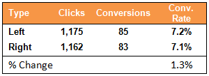
Client A: Left vs. Right
It’s a draw
In this case, we tested the exact same page (same content, same logos, same everything) for 25 days, only moving the form to the left side. A few wireframes below are included to give you an idea -
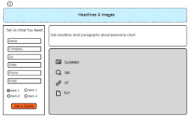
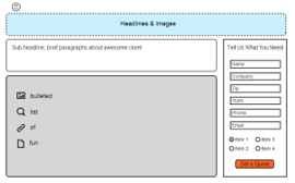
Results: the left focused form had a 1.3% higher conversion rate. A slight advantage, but hardly statistically significant.
Client B: Right vs. Center
Middle wins, but not by much
Much like the Left vs. Right test, for this client we tested the same landing page (same content, same everything) for 30 days. In this case, we moved the form to the middle of this 3-column landing page.
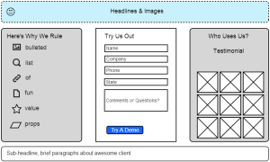
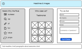
Results: the center-aligned form had a 13% higher conversion rate, but the results were not statistically significant.

So what?
So why did I write a post on tests with next to no findings?
I think the main takeaway from this is that one shouldn’t discount a test/page simply because it violates the norm or traditional best practices. Test everything (especially on landing pages), and don’t knock a page just because the form isn’t on the right. You never know, you might see a big boost just from moving a few columns around!
So what do you think? Have you seen any interesting results from moving LP features away from “the norm?”

