One of the most frustrating parts of optimizing eCommerce category pages—both product listing pages (PLPs) and intermediary category pages—is that there is no one-size-fits-all solution for how to add content to category pages.
If you add too much content that isn’t necessary on the page it could disrupt the user experience. If you don’t have enough content on the page it could hurt your search engine rankings and not provide enough information for users.
We’ve aggregated several approaches to category pages to give you insight into how brands are tackling the problem.
Types of category pages
Before we get into how brands are integrating content into their category pages, it’s important to decipher the different types of category pages.
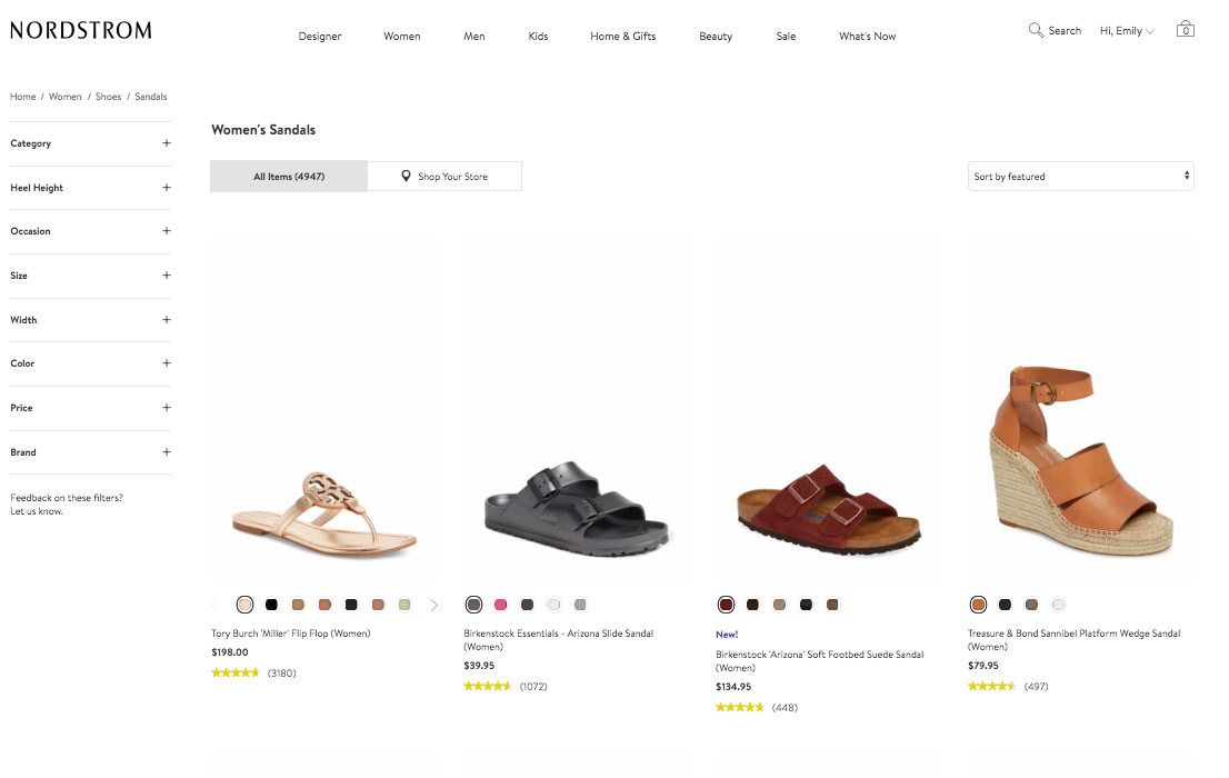
1) Product listing page
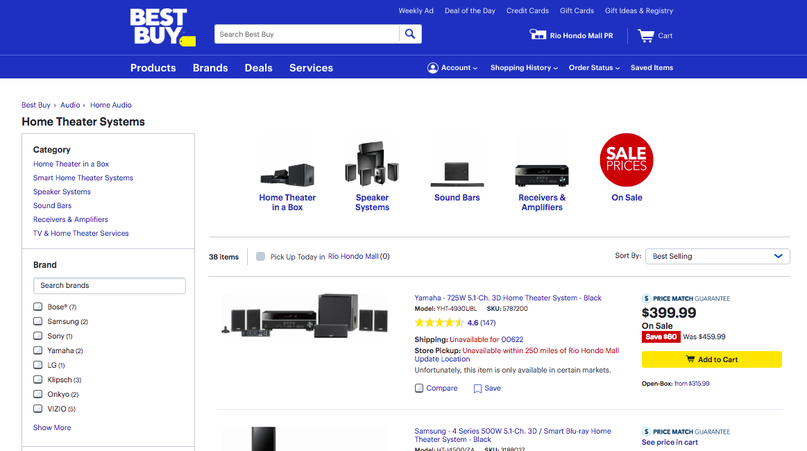
Simply put, product listing pages are where customers can get an overview of a brand's products. These are often broken out by the different categories and have capabilities that allow customers to filter and find the product they’re looking for or browse the overall selection of products.
2) Intermediary category page
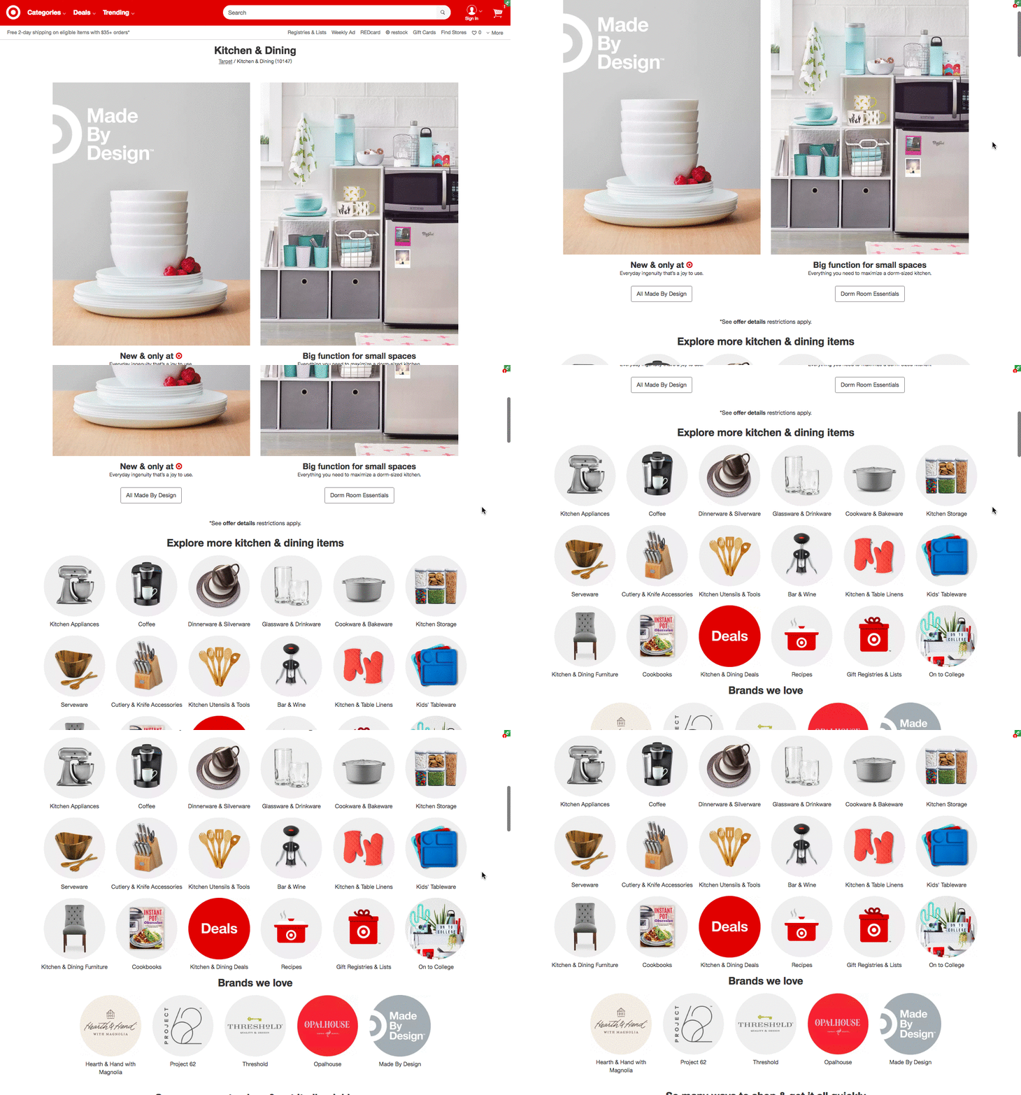
Intermediary category pages do not contain product listings. They give an overview of the different category pages available. These are commonly seen in larger sites to showcase the different subcategories. Many category pages also include guided selling content, on-site specials, and featured pages.
The purpose of intermediary category pages is to help customers who are looking for a specific category or showing customers what particular categories will offer.
Here is an example of Target’s intermediary category:
3) Blended page
Some brands leverage both intermediary category pages and product listing pages onto the same page to offer the best of both worlds. They list products from all categories with specific categories on the top of the page, or they offer related categories that customers can easily click on.
Content on category pages
Now that you’re familiar with the different types of content pages, we’ll outline several ways that brands include content within these pages.
Tip #1: Use informational content and assets in category pages
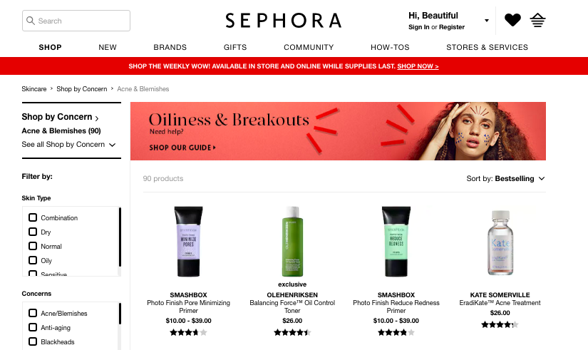
Sephora is one of my favorite examples of how to approach content on a category page. They use a couple of strategies to provide the most value for their users and provide contextual information for Google. One strategy they use is adding banners on top of the page to link users to content that has been created to move them through the purchase funnel.
In the example below, they link to their guide on managing oiliness & breakouts.
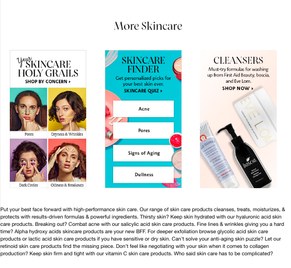
The second thing that Sephora does is link to more guides and assets after the product lists so users aren't overwhelmed, and it also provides a text block for contextual information with Google.
Tip #2: Provide additional context with end of page content blocks
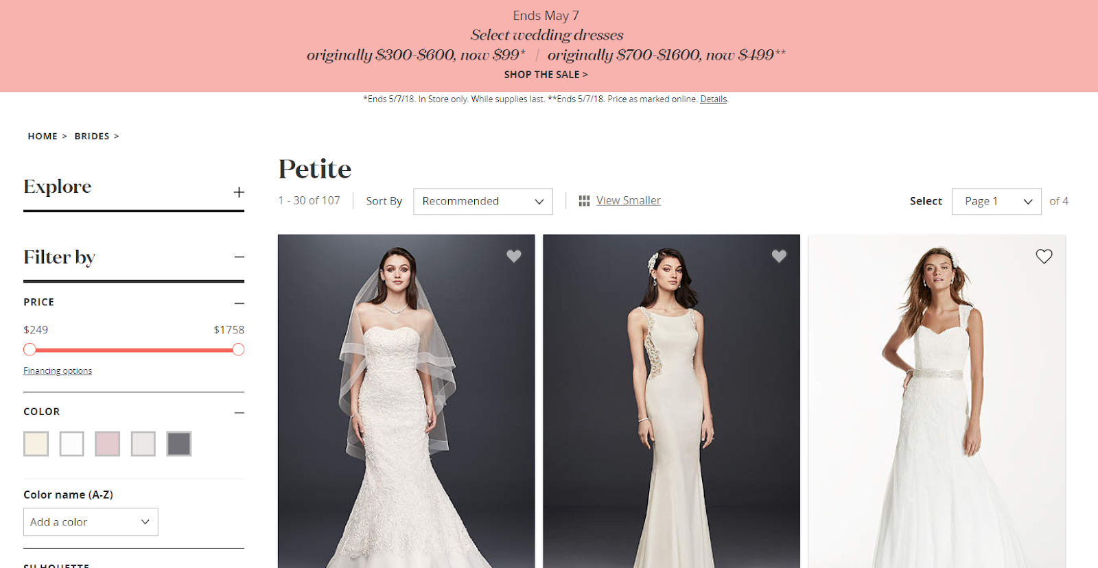
Brands like David’s Bridal & Toy’s R Us use end of page content to provide additional context for audience members. This is typical to provide contextual information for Google as it provides the necessary information that Google can crawl and doesn’t take away focus from the products.
Tip #3: Educate consumers about product differences
Sometimes consumers need additional help in understanding the different categories. When consumers are uneducated about the product they’re looking for, offering some additional information could be helpful. This is especially helpful if you’ve identified in your audience research that your users need help
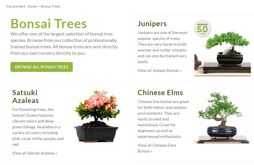
EasternLeaf.com is a great example of adding educational content to category pages. They added short descriptions about Bonsai Trees to help users understand the subtle differences between their products.
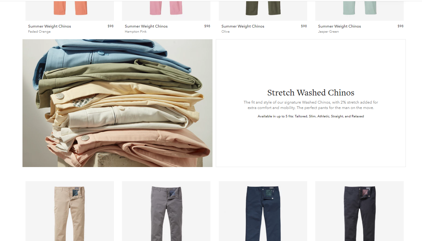
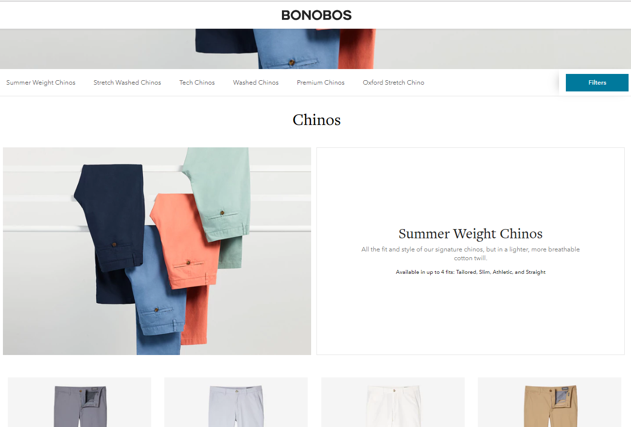
Other companies, like Bonobos, use PLPs as their category pages. Sometimes adding content to these page types is harder because it is easy to distract users from focusing on products.
Bonobos approached adding content to these pages by adding descriptive information around various types of products. Bonobos' onsite experience is catered around browsing. Instead of adding in a filtering system, Bonobos wants you to scroll through the pages to inspire your search experience.
Although implementing product filtering is often seen as essential for providing an excellent on-site user experience, Bonobos goes against this trend and is still known as a retailer with an exceptional online experience.
As you can see, there is no single approach to adding content on your category page. Because of the variance in what success looks like, we suggest doing audience and user testing to determine the best solution for your site. We’d also recommend A/B testing different iterations of content and determine how it impacts both Google’s ranking and your conversion rates.
The key things you should keep in mind when asking yourself how to add content is:
- Is this disrupting the user experience?
- Is this providing our audience value?
- Does this distract the user from selecting products or the proper category page?
