What are some unconventional ways of creating data visualizations?
When Sayf (our director of Analytics) asked this question recently - I found myself instantly thinking of D3.js. D3 is a JavaScript library for manipulating documents based on data.
Why use D3.js?
D3 solves a prime problem for many developers and analysts: efficient manipulation of documents based on data.
It doesn’t seem to have caught much traction in the world of digital analytics yet, and for good reason. It’s far easier to email someone a spreadsheet or PowerPoint than it is to setup and host a website. It also requires the ability to write JavaScript, which makes it less intuitive than a Tableau, Power BI, or Google Data Studio. However, unlike any of these applications, there is complete freedom to design your data however you can imagine in D3, which makes it incredibly versatile. D3.js opens up boring reports to exciting, new, interactive data visualization.
Hosting D3.js Visualizations on the Web
Now that you know a little bit about D3, you are probably asking, where the heck do we host the thing? We could go the route of hosting it on our own server, but I’d prefer not to add more work to this. Wouldn’t it be great if it could all just be done through Google?... …. … Lightbulb!
Discover how to host on the web through Google Apps Script here.
I’ve recently fallen in love with Google Apps Scripts.
As I was looking into how I could host through Google, I stumbled across the ability to share a web page. Isn’t it nice when everything comes together? With hosting out of the way, we can finally get to the fun part: building!
Using sample data from Seer Interactive, how about we upgrade an everyday landing page report using D3.js? We'll need to complete the following steps (but feel free to skip ahead to the final result):
- Google Sheet Setup
- Code.gs Apps Script
- Setting up a Google Apps Script Webpage
- D3.js Apps Script main.js.html Setup
- D3.js Apps Script index.html Setup
- D3.js Apps Script style.css Setup
Step 1: Google Sheet Setup
First, we need to connect a Google Sheet with our landing page data to an Apps Script with the visualization. That way, we can templatize the visualization for easy updating each week by dumping insights and new data into the Google Sheets. There’s not much else to this phase, I just set up some dummy data in a Google Sheet. I decided to make this a fictional, “proof of concept” report using Seer Interactive data, so I set it up as follows:
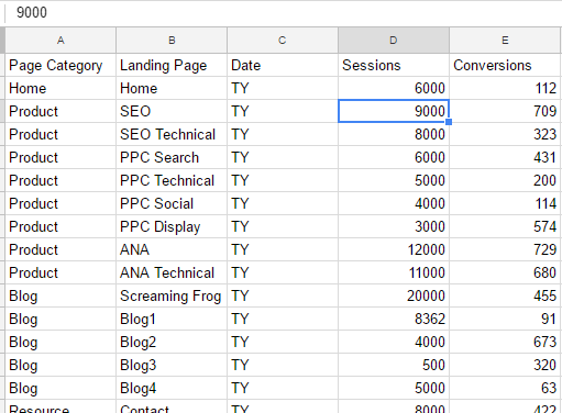
The idea here is that we have a “Page Category” consisting of several “Landing Pages” and I could provide TY, LM or LY as date ranges; all arbitrary, but I figured this way I could add Month over Month and Year over Year if I felt ambitious later. Then, I made up some sessions and conversions so I had some data. Boom, done.
Step 2: Code.gs Apps Script
The next step was to get the data out of the spreadsheet and into my Apps Script. From Excel, click Tools -> Script editor … This will pop open the Apps Script with a default Code.gs template. First, I setup the following bit of code to get the data:

All this code does is create a function called getData that gets the data from either the current active sheet or any sheet name I provide and returns that data. We could parse the data here, but I figured I would take care of that later.
Step 3: Setting up the Google Apps Script webpage
Alright, this project is flying along! Next, we’ll create a new file called index.html. This will be our site going forward. To create the new site, click File -> New and select Html file from the drop down. When prompted, you can name it anything you like. Selecting your new html file, you’ll have most of a website setup for you! There are a few things we’ll want to add at this step.
First, we’ll need the D3 library. It would be hard to work with D3 without it! I also chose to add in jQuery because I like jQuery, but it’s not necessary for this walkthrough.
![]()
Now, to view the website, just click Publish -> Deploy as Web App … and fill in the next page (note: you can set who has access to the app at the bottom!). Hit publish and!... Error. Okay, still a little more work to do here apparently.
Let’s head back to Code.gs.
Apparently, every site needs a doGet function in order to run, so we’ll add that in now!

Alright, let’s try publishing again. You should now have a working website!
Step 4: D3.js Apps Script main.js.html Setup
Woohoo! Finally, we get to mess around with D3! I’m not going to try to reinvent the wheel by giving you the basics here, but I recommend going through the Tutorials offered on the site. Specifically, I went through the first 5 tutorials, including the intro (I’ll admit I skimmed it), all 3 parts of the Bar Charts tutorial, and the one about making a circle, since that encompassed everything I thought I’d need to know. After all, I’m just making a bar chart with some circles in it. How hard can it be?
- Ok, first up, we’ll be adding main.js.html to our project. The purpose of this file is to have one spot we can keep all of our JS code for easy editing.
- Create a new html file File -> New -> Html file and call it main.js.html.
- Next, you can delete everything that’s there and replace it with an open and closing <script> tag.
The first bit of code we’ll add will be an onload function so the page isn’t blank when it loads. Simple enough:

google.script.run.withSuccessHandler is a function that can be used to pass data from the Apps Script to our html document.
The getData function you may recall being in our Code.gs gets the data from our spreadsheet. I’m also passing in selectData, which will receive the data from getData. That means next, we’ll need to create a selectData function:

Since the Google Sheet has additional sheets added to it, we could select which data we wanted (hence that “name” parameter added to the function back in step 2). For now, there’s only one set of data, so the selectData function is a little pointless, but I like to plan ahead. All this function does is call the function to create the chart.
Here is where things start to get a little hacky. It had been a long day of coding to get to this point, so I’ll do my best to break down my reasoning one step at a time, but I’m sure there are better ways to do this.
Finally Parsing the Data
Since the tutorials I used had only one dimensional arrays, I decided to convert all the data into its own 1D array:
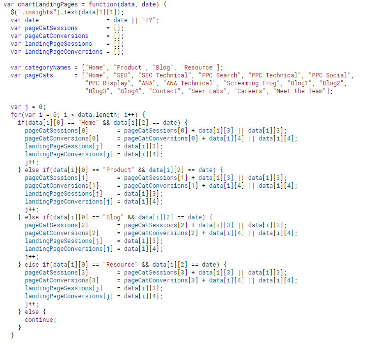
I also set up my categoryNames and pageCats arrays for easy referencing later. Again, yes, there are far more elegant solutions, but this works for a proof of concept.
The data from the spreadsheet comes back as a 2D array, so I’m going to loop through it once and pull out the relevant data. The empty array variables will each hold a different set of data.
- pageCatSessions will hold the sessions value for each page category (blog, home, product or resource)
- pageCatConversions will hold the page category conversions.
- The individual landing page data will be held in the landingPageSessions and landingPageConversions arrays, respectively.
- As we loop through data, we’ll us j to keep track of each unique landing page, while hard coding in the array position for each page category.
With all of our data now in one dimensional arrays, we can start in on the d3 code.
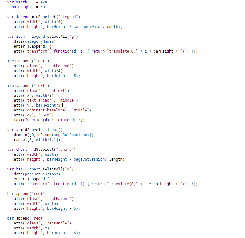
First, I setup the legend. We’ll get to this step shortly, but I have two svg elements in my html that I’ll latch onto, one with a class called legend, and one with a class called chart. Here, d3.select(“.legend”) is latching onto the legend svg element and setting it up. Within that svg element, we create some “g” elements and attach our data. No need for any visualization here, just binding data so it shows the legend.
Now, set up the bar chart. The tricky part here is knowing which data to attach where. Also, when setting up the range portion of the scale, I decided to divide my x by 1.1 to make sure that no bar would reach 100% scale. This was a purely visual decision.
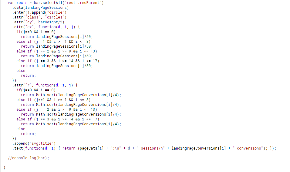
Adding in the circles proved to be much trickier than setting up the horizontal bar chart. For one thing, I needed to figure out how to only include the landing pages to their associated page category. This was accomplished by a series of if statements using i and j in the functions to determine what landing page values should be returned.
i and j are iterators passed into the functions where j correlates to the rectangle we’re currently in (0 is homepage, 1 is product, 2 is blog, 3 is resource) while i is the position of the data array.
A little tricky, but if you throw a few console logs in each of those functions it’ll become a lot more clear. The divide by 50 and Math.sqrt are purely for aesthetic design and impact the scaling/location of the circle.
Step 5: D3.js Apps Script index.html setup
Next, we’ll want to add on to our index.html web page, so our D3 select statements don’t error out.
![]()
Also, while we’re here, the next step is going to be adding css to make sure our charts look somewhat decent:
![]()
Go ahead and put that line in the head somewhere so it’s referenced. Last up, before the closing </body> tag, we’ll add in a quick line to reference the main.js file we created:
![]()
Step 6: D3.js Apps Script style.css setup
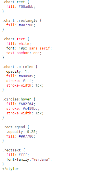
We’re at the finish line! Create one final file File -> New -> Html file and call it style.css. Delete the existing code and replace it with an open and closing <style> tag. Then, we’ll add the following styles:
D3.js Chart
Check out the final result below:
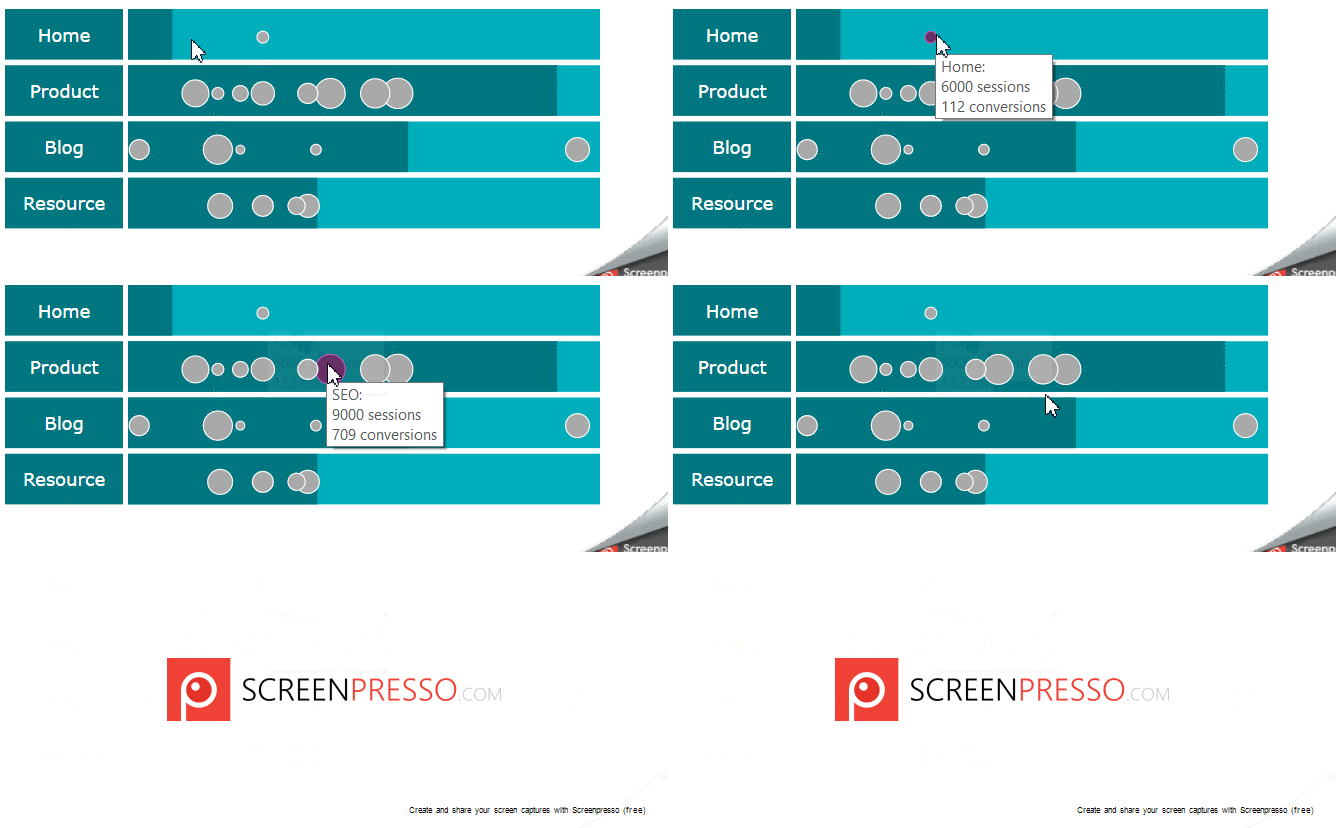
- The idea here is that the bar chart represents the number of sessions for each landing page category
- The circles represent the landing pages themselves
- The position of the circle along the x-axis is dependent upon the number of sessions (higher is more to the right, lower to the left)
- The size of the circle depends on the number of conversions it drove
- On hover, you can see a tooltip including the landing page name, and hard number values. Pretty cool, right? Try doing that in Excel!
Overall, I have to say I really am impressed with the D3.js library and the awesome visualizations you can create. I think I have a long way to go towards being able to use it efficiently, but for a first pass I think this went pretty smoothly! I have some thoughts on next steps, but I’m really liking the design overall. And of course, big ups to Google Apps Scripts for being such an amazing and awesome tool!
Stay up to date with our #dataviz tips and tricks (and more) by subscribing to our Newsletter below!
Subscribe to our newsletter to receive monthly digital marketing updates!

