When I first got my hands on Tableau, I thought it would be super easy to create pretty and informative data visualizations. As it turns out, there are a lot of little details that go into it (just take a look at some of the Tableau Zen Masters' work).
By collaborating with other Analytics team members and making lots of Google searches, I’ve learned a few tips and tricks in Tableau 10 that help me create my visuals. In this post, I’ll share my learnings with you and hopefully you’ll learn a thing or two you didn’t know about Tableau.
Where to get Tableau inspiration
- Tableau Viz of the Day - One of the best ways to get ideas for your visualizations is to see what others are up to. Check out the viz of the day when you need inspiration, or follow some of the Zen Masters’ blogs.
- The Big Book of Dashboards - It’s a great book to have for inspiration, but their website also features examples and a lot of them are done in Tableau.
- Google It - When in doubt, I always turn to Google for help when I’m struggling. Even something as simple as a stacked bar chart isn’t as easy to make as it seems, but a quick Google search can solve this, no problem.
Before you create a data viz in Tableau
You should understand what data you’re working with before you start, and clean it up as much as possible. Without a thorough understanding of your data for context, you’re likely to create additional problems down the line.
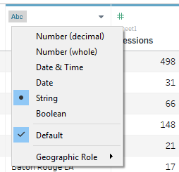
Assign data types - In the data source tab, you can see how Tableau automatically classifies your data as a string, number, and so on. Tableau tries its best, but isn’t always perfect here. Go through your columns and make sure they’re correctly identified.

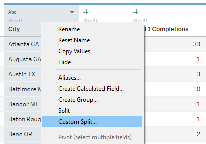
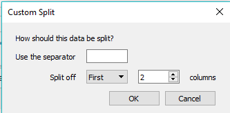
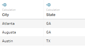
Split Columns - Have a string of text that you want to split up into two columns? Let’s say you have data with a city name and state in the same cell (Philadelphia, PA) but you want to split this up. Here’s how:


Create Relationships - You can either join or blend your data within Tableau. If you want to create a relationship between different data sources (ex. An Excel file and a data pull from Google Analytics), you’ll need to blend them based on a common variable between the two sources. Blending is done within a sheet in Tableau by clicking the blend icon (Tableau sometimes does this for you automatically).
If you have multiple tabs within an Excel file that you want to combine, you can join them in the Data Source tab using an Inner Join, Outer Join, and so on. More from Tableau here.
When you're working on a data viz in Tableau
- Explore now, format later - Tableau makes it tempting to apply custom formatting at any point, but don’t get caught up in this too early. Oftentimes I’ll format a WIP visual, only to change it later on and lose a lot of my customization.
- Duplicate Sheets - There are a lot of moments within Tableau when I’m not sure what my next steps are, and I’m in the data exploration phase. Maybe I’ve made a semi-decent viz, but think I can make it even better. I’ll often duplicate the Tableau sheet I’m working on, allowing me to keep a copy of my OK chart and have another copy to completely mess up (without having to click the undo button 22 times).
- Use what Tableau gives you! - Calculated fields, groups, bins, and more. Read up on how to make the most of the built-in functionalities of Tableau
- Automate As You Go - This is a pretty important trick if you’re making visuals that you’ll need on a weekly or monthly basis. As long as you keep your data consistently formatted (or pull data in directly from Google Analytics or another source), you can simply update the date ranges and your visuals will be good to go. You can even take it a step further and create calculated fields that update the date range for you.
Putting in the effort at the beginning will save you a ton of time in the future.
How to present your new data viz in Tableau
Once you have your perfect sheets created, it’s time to share them in a document or presentation. However, it’s pretty well known that Tableau files aren’t the easiest things to share with others, especially if you’re sharing confidential data that you don’t want on Tableau Public. At first I was spending my time taking careful screenshots of my work, but I’ve found some tricks to make this easier and much faster.
Import custom color palettes - According to Tableau’s instructions, you can make as many custom colors palettes as you want (for your company colors, client colors, or maybe just your favorite colors). This will keep your formatting consistent and impress your audience by nailing their exact color palette. If you don’t know the HEX values for the colors you want, use a color grabbing tool like this Chrome extension.
Use Dashboards for Formatting - Tableau makes it easy to arrange your visuals and legends within dashboards, especially when you want to keep things consistent for a presentation. I start by making one dashboard, choosing a size and layout that works best, and then I duplicate that dashboard and replace the sheets for each one.
The entire process of using Tableau can be long, starting with importing your data to presenting your visuals, but the finished product makes the time commitment well worth it! Keeping some of these tips in mind will hopefully save you some time and hassle, but don’t stop searching for new Tableau tricks as you work. Share your favorite tips in the comments below, or keep reading about data visualization here.
Want to learn more tips from the analytics experts at Seer? Subscribe to our newsletter to get more analytics expertise in your inbox.


