I have 3 Google Analytics analysis tips that I share with every new hire in the Seer’s Analytics division, that I feel are critical for the success of any beginner doing analysis and searching for actionable insights. I’ve found, through my time analyzing data, that there are three basic tools any analyst can and should use to find these insights.
For anyone familiar with the Pareto Principle, I think this is the analytics version of that.
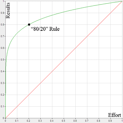
With 20% of the functionality in Google Analytics, you can extract 80% of your analysis value. To our new hires, I argue, that these are tips that can automatically put you in the top 20% of everyone who looks at their GA data. With that in mind, let’s dig into the tips!
Google Analytics Tip 1
Secondary Dimensions
For anyone familiar with the role that dimensions play in Google Analytics, these are any areas that describe the data that you are looking at (while metrics show the volume/rates/value of these dimensions). In isolation, each dimension is useful in and of itself - you need Source / Medium to see how traffic is getting to your site, Landing Page to know where they are starting, and Goal Completion Location to know where they converted.
But, the true power of dimension value comes not in isolation, but in combination.
Think of it this way - if you are standing outside of a pyramid (and had the right tools), you can likely roughly describe elements about it.
How many bricks there are, the color, the height/width/length, etc. But the true power comes from digging deeper.
If you step inside the pyramid, you can see how the previously hidden aspects (what’s inside, volume, etc.) combine with what you can see on the surface, and find the relation of the elements to each other.

By combining two dimensions together, like Source / Medium and Landing Page, you can not only see how the user got to your site, but where they started their journey on your site.
If you click into a dimension value, and then switch the primary dimension and secondary dimension, you can essentially “buy yourself” an extra dimension in the interface.
A list of some of my favorite dimension combinations:
- Source / Medium and Landing Page (how they got there and where they start)
- Referral and Referral Path (how they were referred and from what page they were referred)
- Landing Page and Exit Page (where they started and where they left)
- Any of Event Category/Event Action/Event Label together (and Page) (to show where the event occured!) (what event happened where and what can we do about it)
- Device Category and Mobile Device Info (what type of device did they use and what are the specifics on the device)
- Region and City (what is the user’s estimated location based on IP address)
But, honestly, assuming you have the same analytics scope (hit, session or user) on each dimension, nearly all combinations can be valuable. 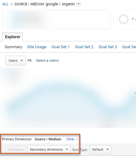
If you need more than three dimensions for analysis, I’d recommend to use the Sheets API (up to 7 at once) or Data Studio.
💡 Why It’s Valuable: Allows you to analyze more than one dimension at once, which allows you to drive better insights on your data.💡
Google Analytics Tip 2
Advanced Filters
Once you’ve mastered the art of using secondary dimensions, it is on to filtering that data. Filters limit the data that you are analyzing to only the data you need/want to see, which makes it an invaluable tool.
Google Analytics doesn’t display the advanced filter options by default, so it is easily something that someone less advanced could miss running through the interface:

GA filter drop-downs have several options for you to use, which we’ll break out below:

- Exactly matching - As noted, this exactly matches your filter input, down to every single character. Use for: Strict match scenarios
- Matching RegExp - If you are advanced enough to use Regular Expressions, this is your go to. Use for: Complex matching situations
- Begins With/Ends With - I’ll bucket these together as two sides of the same coin. This allows you to choose what the value starts or ends with. This could be useful to capture all Apple devices, Google sources, email mediums, etc. Use for: Unique/broad scenarios
- Containing - This is your most broad, but often easiest way to go. Use for: Very broad scenarios
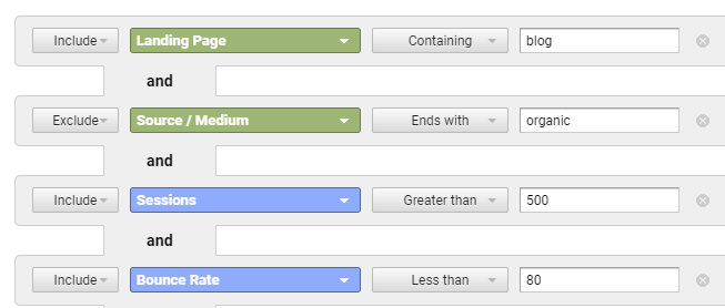
You can also include or exclude data using filters, which is a very useful feature. With this functionality, you can include some data while excluding other data (either on the same dimension or multiple dimensions - but all filterable dimensions must be visible in the report itself), as you can filter on multiple aspects at once. Example below:

This will return all users who start on a blog page from non-organic sources. I’m sure you can think of many scenarios for how this include + exclude scenario can be useful.
Not only that, but you can also use these filters on metrics as well, which can be powerful to limit your data further. I typically find myself using this for setting traffic, bounce rate, or conversion rate “thresholds” for my data.
Metrics have the following drop-down options, which are pretty self-explanatory:

Imagine how tailored you can make your data with these filter options, and by drilling down into these items with secondary dimensions before, your filter options/value increase even further!
💡Why It’s Valuable: Allows you to have a crystal clear focus on exactly the data that you want to analyze.💡
Google Analytics Tip 3
Absolute Change Sort
This is perhaps my favorite of the three tips, and the least known among the three. This is another “hidden in plain sight” option in GA, which is only available when comparing data over multiple date ranges.
Data is best analyzed in a contextual and historical manner, and this tip helps you extract the most value from that.

So what does the absolute change sort do? Without getting too much into the math aspect, Absolute Change simply looks at the pure difference between a metric during two time periods. How is this different then how GA normally is displayed? An example:
If you look at your Source / Medium results with the Default sort, you naturally see highest to lowest based on your selected metric:
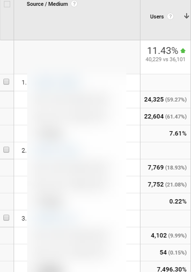
But when using the Absolute Change sort, this now shifts to show you the highest pure gains during the period:
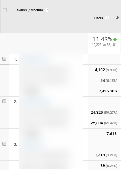
You can see, what was previously #3 is now #1, as that had the highest gains in terms of Users during the period. This can also be done the opposite way, to show the largest decreases.
💡Why It’s Valuable: If analysis at its core is best with comparable time context, and this allows you to find the highest gains and drops, this provides you with an immediate plan of action.💡
- Large increases > why is it up? > is it notable enough to take action on? > If so, take action/If not, monitor for later
- Large decrease > why is it down? > is it notable enough to take action on? > If so, take action/If not, montor for later
When looked at within that framework, this tool is at the backbone of any type of weekly/monthly/quarterly/recurring analysis with comparable date ranges.
Applying These 3 Google Analytics Tips
Now that you know these three tips: secondary dimensions, filters and the absolute change sort, the power comes from the combination of their usage. Let’s go through an example:
- You see there is a large increase in total sessions MoM.
- You go to your Source / Medium report, and using Absolute Change sort, you isolate the increase to Organic and Email sources.
- You use your advanced filter to return only those two mediums (ends with criteria).
- You then use Landing Page as a secondary dimension to see what pages these sessions were driven to.
- By using your Absolute Change sort again, you then see that your Organic boost was from new content you published and your Email boost led to a ton of new conversions (and $ in the process!).
- Your actionable insights from this lead you to find new ways to promote the new content and also scale the Email delivery methods to future communications.
Data is only as good as it is actionable and this is your roadmap to getting your data into an actionable state. Going back to the pyramid example, you can know some things just from standing outside, but the true value comes from digging down deeper.
With that note - what will you find in your data: the riches of King Tut or a broken-down shrine that you can fix?


