Overview
Challenge
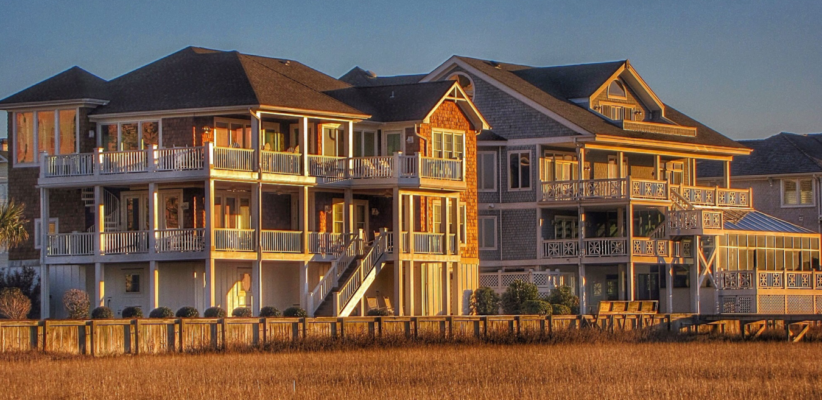
Twiddy & Company is the #1 property management firm on the Outer Banks of North Carolina, offering more than 1,000 vacation rentals - and it all starts at Twiddy.com.
Twiddy.com makes vacation planning easy by providing guests with detailed property descriptions and all the vacation resources one could need to help ease them into an Outer Banks state-of-mind.
However, qualitative data revealed there were some common questions and concerns about the booking process that were not clearly answered on the website.
Hypothesis: We believe we can we increase bookings by anticipating questions that prevent people from starting the booking process.
Approach
Our Director of CRO, Rafael Damasceno, and his team conducted extensive audience research to understand the on- and off-page user behavior and identify barriers to users booking a vacation home -
We used email surveys and chats to collect customer feedback and uncover key insights.
Responses pinpointed a lack of clarity around the final steps of the booking process.
Confusion about pricing, payment and check-in were a common theme in the user feedback, with over 47% of all chat responses pertaining to check-in info.
Not addressing these questions clearly in the checkout process presented a barrier to book.

In fact, we found that users who visited Twiddy’s Guest Information page, which addressed their most common questions, had a conversion rate 10x higher than users who did not see this information.
Our goal was to make this information readily available to encourage more users to initiate the booking process and complete checkout.

Execution
Using the findings from the research phase, we redesigned the property details pages to include content from the high-converting information page and establish a hierarchy that mapped back to the audience insights.
To support our hypothesis, we applied two key changes to the variation:
- Pulled key property details - i.e. price, location, number of bedrooms - above the fold to increase visibility, making it easier and faster to compare houses open on multiple browser tabs.
- Incorporated the expandable FAQ structure of the Guest Information page to address user questions.
We tested the new page structure and content across property pages to measure the impact on conversions.

Results
When we tested the new page variation against the original property page, our main goal was to increase the number of visitors starting a booking process.
With the new home details page, we were able to not only increase the number of visitors starting a booking process by 18.1%, but also increase transactions by 15% - resulting in an estimated annual increase of $1.575 million in gross revenue.
Based on the statistically significant results of the test, Twiddy launched the new property details page to improve the user experience and optimize conversions for all users moving forward.
“This clearly has a huge financial impact and it’s a giant win. This increase in conversion also decreases our reliance on paid spend—and decreasing that actually has a bigger and faster multiplier.”
