Why accessibility matters for SEO and content marketing
The goal of both SEO and accessibility is to make your content more available to visitors regardless of the device they're using or the situation they’re in. A focus on accessible content can drive revenue for your organization and save money.
Whether your site visitor is a professional on a busy train, someone with visual impairments, a parent cooking dinner, or a search engine crawler, creating content with accessibility in mind provides the best experience by enabling the consumption of your content.
In this article:
- What is web accessibility?
- Why create accessible content?
- The SEO and accessibility overlap
- Content and accessibility
- Semantic HTML for accessible pages
- Tools for addressing accessibility
What is web accessibility?
Accessibility refers to when websites and other web tools are designed and coded in a way that all people (including those with disabilities) can navigate, use, and understand them, according to the World Wide Web Consortium (W3C):
When we say a site is accessible, we mean that the site's content is available, and its functionality can be operated, by literally anyone.
-- Google Developers, Accessibility Fundamentals
Currently, much of the web is difficult to navigate and use for some visitors because sites are developed with accessibility issues inadvertently or it’s not a priority during the creation process.
A 2020 study from WebAIM identified that 98% of the top websites (globally) do not offer full accessibility.
Impairments that can impact how individuals experience the web include (but aren’t limited to) visual, hearing, intellectual, cognitive, situational, environmental, and physical.
The international standard for web accessibility is WCAG (Web Content Accessibility Guidelines). WCAG is useful for developers, content creators, and anyone wanting to make their information more accessible on any device.
The W3C provides the 4 principles of web accessibility with the acronym POUR, each principle has criteria to assess success within that pillar.

- Perceivable - Content is available to be consumed via multiple senses (sight, hearing, and/or touch)
- Operable - User interface (forms, navigation, hover/mouseover elements, etc.) are approachable to visitors
- Understandable - The navigation of content and the content itself is able to be understood by visitors
- Robust - Content is rich enough to be engaged with via a diverse set of users agents
💡 Learn more about POUR from W3C.
What is a screen reader?
A screen reader translates the content on a webpage into audio or braille for visitors who need assistance consuming content online. A screen reader allows visitors to use the keyboard or a braille display to navigate the web instead of using a mouse.
If you have never been exposed to the experience of the web using a screen reader, take a moment to watch these two videos:
- Screen Reader Demo for Digital Accessibility (UCSF IT Web Services)
- Screen Reader Demo (Office of Information Technology at CU Boulder)
Accessibility does not only apply to visitors who use a screen reader; however, the demo of the screen reader will begin to build a foundation of understanding and empathy for all web users.
Accessibility needs can be situational
Remember that a visitor’s needs may differ based on circumstances based on their environment, objectives, or current needs.
Situational needs alter how we may need to consume information. An auditory example is a noisy coffee shop or train where text or visual content is needed. A physical/current needs example could be holding a baby or cooking/cleaning where information delivered via audio would be most accessible at the moment.
Providing multiple ways to consume content including visual, audio, video, text, interactive tools, etc. ensures that it will support users' needs and meet them where they are instead of making assumptions about what they might need.
As content creators, we should ask ourselves:
How can this content be more accessible to visitors in all situations?
Situations where accessible content wins
- An auditory learner will want to consume new information with a podcast rather than a piece of long-form text content.
- Someone on an airplane who forgot their headphones would appreciate closed captions or a transcript for a video.
- An infographic highlighting key points makes it easier for a marketing professional, looking for industry information, to integrate insights into their presentation.
- Note: infographics should be accompanied by text that explains the image or styled to be hidden from view. (CSUN’s accessible infographic)
- A consumer who is reading in a language that is not their first language may benefit from simple content, with short paragraphs, and no higher than high school-level readability score
Why create accessible content?
Good for humans
Be inclusive to visitors with disabilities and provide a better experience for everyone.
Why wouldn't we want to contribute to a better digital environment? An environment where information is approachable to everyone in any situation. This includes variances in socioeconomic backgrounds, education, or physical and cognitive abilities.
Level Access found that the top 2 reasons businesses addressed accessibility were to ‘include people with disabilities’ and ‘provide the best UX for all users.’
Good for business
1) Improve market share, brand reputation, and organic visibility.
The W3C lists improving innovation, enhancing brand image, and extending market share among the top reasons for organizations to optimize their web accessibility.
- According to Statista, approximately 60% of Americans with disabilities are living in a house with internet access.
- Over 1 billion people globally are experiencing some form of disability according to the World Health Organization
- The United States Census Bureau found that ~13% (over 40 million) of the U.S. population identified with experiencing a disability

Level Access’ State of Digital Accessibility report suggests web accessibility practices increase consumer loyalty, enables work to be more valuable in the future, and Increases organizational efficiency while decreasing operational costs.
2) Avoid lawsuits (and friction to purchase)
According to Accessibility.com, web accessibility lawsuits increased over 14% from 2020 to 2021 with the most targeted industries being consumer goods, services, and retail. In 2021, there were 265,000 ADA (Americans with Disabilities Act) compliance demand letters in the U.S.. Conservative estimates from BOIA, based on the Accessibilitity.com report, indicate that U.S. businesses collectively spent $3.3-6.6 billion in ADA compliance lawsuits on settlements and legal fees.
Almanac News reported that compliance settlements can be as high as $26,000 (not including legal fees).
Examples of organizations involved in ADA compliance lawsuits:
- Beyonce’s official website (Source: iMPACT)
- Dominos Pizza (Source: BOIA)
- Burger King (Source: Top Class Actions)
- Netflix (Source: NAD)
- Harvard (Source: NAD)
- Uber (Source: ADA)
- Five Guys (Source: ADA Title III)
The SEO and accessibility overlap
Accessible Headings: Do’s and Don’ts
Your page headings should be logical and descriptive to provide a skimmable experience. Headings provide topical associations of passages for both readers and search engines.
Do:
- Create headings prior to writing your content
- Implement headings to support the hierarchy of your information
- Use headings in ascending order (h1, then h2 & h3, etc.)
- Note: it is appropriate to nest headings within content
<h1></h1>
<h2></h2>
<h3></h3>
<h2></h2>
<h2></h2>
Do Not:
- Use styling, like bolding, sizing, or coloring, in place of headings
- Use headings out of numerical order (e.g. h1, h2, h5, then h3)
- Use an h1 that varies drastically from the title tag
- Overuse headings
💡 Explore additional best practices for headings from Yale.

Page speed
Users on mobile devices, older phones with less processing power, or weaker networks can impact how visitors are able to navigate and access your site’s content.
Pages that are slow to load are less accessible to some demographics/geographics than others based on their networks (location or economic means) or strength of network (based on the location of the nearest cell tower).
Webpages can load slowly due to heavy amounts of JavaScript and CSS, large-sized images which aren’t deferred offscreen, or have many plugins and widgets that can affect who can access the content in an efficient way.
💡 Review the performance of your pages using Google’s Page Speed Insights tool.
HTML sitemaps
An HTML sitemap (often linked in the footer of the website) can provide visitors using a screen reader access to the whole site as an alternative to the main navigation. The HTML sitemap provides an overview of the site and highlights how the content of the site is organized.
The HTML sitemap can provide additional context to search engines, along with an XML sitemap, to understand the structure and relationship of your site and its content.
WAI’s sitemap is an example of an HTML sitemap in practice.
Image filenames
The filenames of images help visitors using screen readers (when the alternative text attribute isn’t included) and search engines understand your visual content:

For the above image, an example of an unoptimized image file name would be “https://www.site.com/images/654.png”.
For the same image, an improved file name would provide context for what the image is, the file name could be “https://www.site.com/images/blue-faced-dog.png”.
Image alternative text
The alternative text attribute of the image element is meant to describe the image when visual consumption isn’t an option. This is useful for users of screen readers and search engine crawlers to understand images.
Image files names are read for images without alt text. As an example, consider the experience of the very very cute picture below:

Without alt text:
<img src="https://www.site.com/images/23411026789787.png">
A screen reader would read the image file name followed by ‘image’. In this case, the visitor would hear "/23411026789787.png, image". In the common case of long and non-descriptive image file names which don’t provide context to the visitor and provides a poor experience.
With alt text:
<img src="https://www.site.com/images/23411026789787.png" alt="Black and Grey Dog Smiling in a Grassy Yard">
A screen reader would read the image alternative text followed by ‘image’. This provides a much better experience.
Alt text best practices
- Describe the image within the context of the page
- Exclude ‘image of’, ‘picture of’, ‘thumbnail of’
- Screen readers already say ’image’ and search engine crawlers understand it is an image because of the image element.
- Use empty alt attribute for decorative images (purely visual purpose and adds no value to the content of the page).
- When possible, decorative images should be provided via CSS
- Example: <img src="https://www.site.com/images/654.png" alt="">
- Limit the character count to 125
Anchor links
Link anchor text should be descriptive and make sense to readers outside of the context of surrounding content. Visitors using screen readers are able to navigate a page from link to link. Therefore, it’s essential to explain where the link will take them. Search engines can use link anchor text as a signal for what the destination is about.
A common approach to internal linking strategy is to use variations of a page’s topic as anchor text on the pages that link to it. This provides helpful context for both search engines and users.
An example of clear and concise anchor text that provides insight about the destination page:
Text containing ‘Learn more about Fern the dog’ which links to fernthecutedog.com
<a href="fernthecutedog.com">Learn more about Fern the dog</a>
Compared to:
A picture of fern linking to fernthecutedog.com with no additional context
<a href="fernthecutedog.com"><img src="https://www.site.com/images/blue-faced-dog.png"></a>
Additional examples of link anchor text that provide very little context about the destination page include only using ‘learn more’, ‘read more’, ‘click here’, ‘more info’, and ‘download this’.
Structured data
Structured data provides additional information and context to visitors and search engines. Ecommerce services and pages primarily relying on dynamic content can benefit from marking up their information. Schema.org and JSON-LD are widely accepted languages to convey the data.
Structured data allows for more accessible search engine results pages (SERPs). It provides clear context and information about your site’s content (even if there are no SERP features that can be gained).
SEOs use the power of structured data to earn rich snippets and improve click-through rate and visibility within the SERPs.
Content and accessibility
Mixed mediums
Creating content in multiple mediums enables visitors in a variety of situations to consume the information. An example of the same/similar content in a different way can be a page with the recording of a podcast, a text-based transcript and summary of the episode, and an infographic that displays the key points.
Providing multiple ways to consume content (visual, audio, video, text, etc.) ensures visitors can access the content regardless of their environment or circumstances and gives search engines a holistic understanding of each of the mediums provided.
Page table of contents
Adding a table of contents (or a what to expect) to your long-form content is an effective way to increase the usability of the page for scanning for busy readers and provides a more approachable way for mobile visitors to access the specific information they came looking for. Using jump links in the table of contents allows users to navigate directly to the section they want to read.
Similarly, a table of contents improves accessibility by providing an overview of the content to come and empowers visitors to go straight to the section of interest.
The top of this article is an example of providing a table of contents with jump links deeper into the page.
Readability level
The readability of your content allows for a wide audience to understand what you’re attempting to convey. Your web pages are more helpful to visitors when written at a level that is friendly to people of varied abilities.
How approachable your content is can depend on its readability score, descriptiveness, and whether it contains short and concise paragraphs.
W3C recommends lower secondary education as the target readability level for most content to be accessible. Lower secondary is defined by the National Center for Education Statistics as the “loose equivalent of intermediate school, middle school, or junior high school” (in the United States).
For more readable content, avoid:
- Ambiguity
- Acronyms
- Abbreviations
- Industry jargon
💡 To assess the readability of your content, try a tool like Hemingway Editor.
Keyboard accessibility
Site owners can use focus indicators within their web pages to allow their content to be navigated from a keyboard.
For example, users might navigate a web form with their keyboard, using the tab key and enter key. The escape key is another great example of a common keyboard command used to exit out of a video or image pop-up.
💡 Want to view the tabbing order of your web page? Check out the Accessibility tab in Firefox’s web developer tools.
Semantic HTML for accessible pages
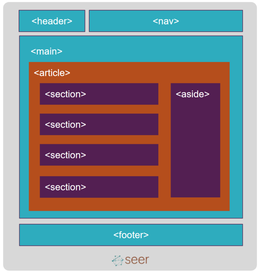
Semantic HTML gives meaning to the elements and context for what is available on the page. In this way, the use of semantic HTML can support both humans and crawlers in understanding your pages.
Non-semantic element examples
- Div
- Span
Semantic element examples
- Button
- Table
- Paragraph (p)
- Headings (h1- h6)
- Navigation (nav)
- Article
- Footer
- Lists (ol, ul, dl)

Semantic HTML can improve your site’s organic search visibility (e.g. headings) and is much closer to the way that people speak. The use of semantic elements identifies various types of data within your pages by providing a clear hierarchy.
Additionally, the use of contextually relevant HTML can help site owners and developers orient and navigate around a site’s code.
Tools for addressing accessibility
- Accessibility report within Google’s Lighthouse
- Accessibility Evaluation
- Replicate the screen reader experience
- Crawlers (products like ScreamingFrog or DeepCrawl)
Go forth and make the web a better place
Many site owners and developers think accessibility is a high-effort afterthought to the creation of their site. We need to flip the script on this belief and acknowledge aspects of accessibility should be incorporated into everything from site creation to site updates. Businesses that understand the value of leading with empathy provide a better experience for everyone.
Getting started with accessibility for your site?
- Read about Accessible Design from Seer’s Creative Team
- Review WebAIM’s checklist
- Create an accessibility statement for your business
- Download our Accessibility Guide produced in partnership with O3 World
Note: This is not a comprehensive list of web accessibility requirements. Rather it's a starting point for marketers and SEOs into a gateway of understanding and optimization for all site visitors. For more info visit the Web Accessibility Initiative.
If you’re looking for a people-first approach to your organic search and content creation strategy, contact Seer today.


