Premade reports in Google Analytics show you a ton of information about who comes to your website. But what if you’re trying to answer a more specific question, such as “In this specific region of the country, what specific areas are driving the most users to my website?”
What should you do when Google Analytics doesn’t have a premade report for that? You’re in luck, because using primary and secondary dimensions in GA can put you on the right path to answering this question and many more.
Wait, what’s a dimension again?
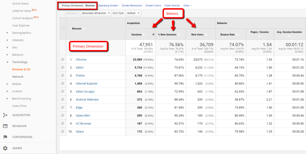
Dimensions are qualitative attributes about your data. Think of them as categories that identify a user, such as the type of web browser someone is using when they visit your site. For example, the “Browser” dimension breaks down into many specific browser types, like Google Chrome and Safari.
When you click on a report in GA, a pre-selected primary dimension is shown on the left hand side (in rows) and is measured by quantitative attributes called metrics (which appear in columns).
How can I use dimensions to answer a specific question?
When you click on a report, the first thing you can choose is which primary dimension you want to drill into within a report. Google Analytics will always choose a default primary dimension for a report, but sometimes a different primary dimension can provide a unique perspective on your data.
For example, let’s say you went into the Geo > Location report and drilled down by clicking on the United States.
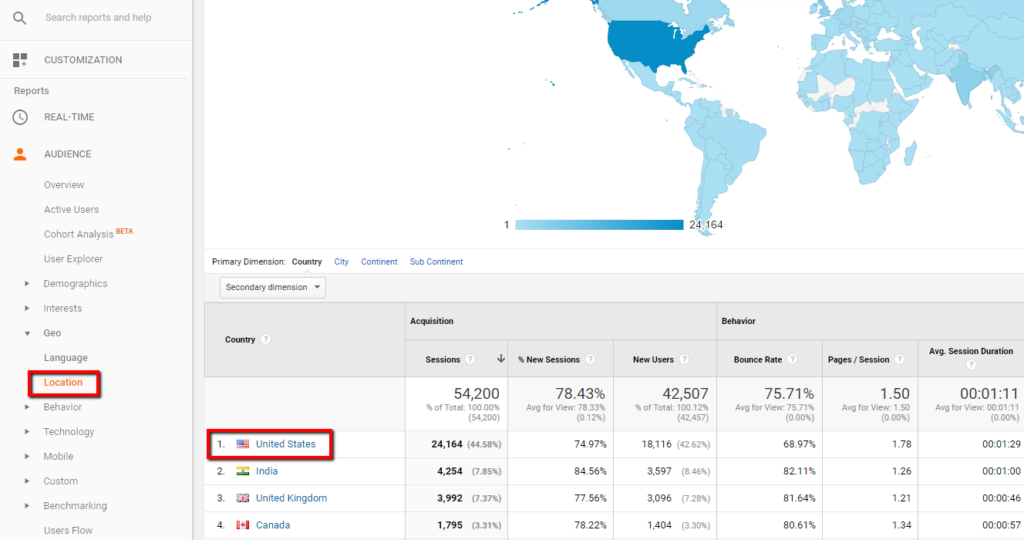
This brings you to a report for US data, but the default primary dimension categorizes the data into “Regions” (AKA states).
When you look at data with the Region primary dimension, the states of California & New York will often appear to generate the most traffic to your website by state - but wouldn’t you expect the largest states by population to have the most sessions?
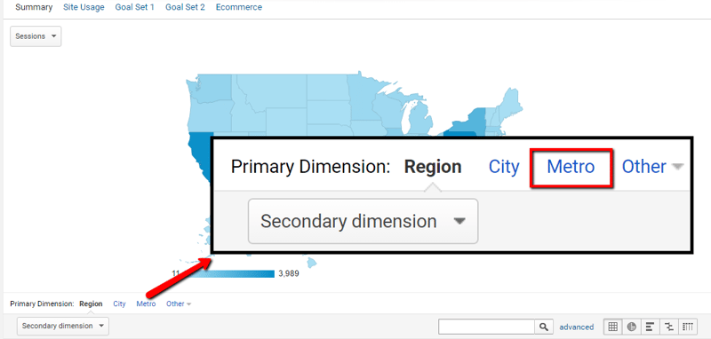
By choosing the Metro primary dimension instead, we see that the most traffic comes from the Philadelphia metro area as a whole (including Philly, Southern NJ, and Delaware), more than any specific metro area in California or New York.
This can be really helpful if you’re located in a city near state borders since the entire metro area is included, rather than having data split between multiple states.
Awesome, now I can drill down to a specific location!
But choosing a different primary dimension isn’t the only thing you can do. We’re able to see that the Philadelphia metro area is driving the most sessions, but we still need to answer the rest of your question. How are these users getting to your website? By clicking on the Secondary Dimension drop down, you can find your answer.
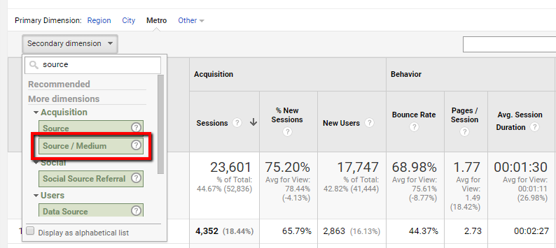
Step 1: After clicking on the Secondary Dimension drop down, click on the “source / medium” secondary dimension. This shows how users are most often coming to our website from specific places on the web, such as another referring website.
Notice how the secondary dimension is applied to all results that the Metro primary dimension displays (way more than we need to look at). We can click on the “Advanced Filter” search options to get even more specific with our results and see only dimensions meeting certain criteria.

Step 2: Click on the "Advanced" button to show advanced filter settings.
Step 3: Next, we want to include the Metro area of Philadelphia, PA as our focused area we want to see.
Step 4. Within the advanced filter, we can also include only sources that contain the term referral," which would mean the user came to our site directly from another site.
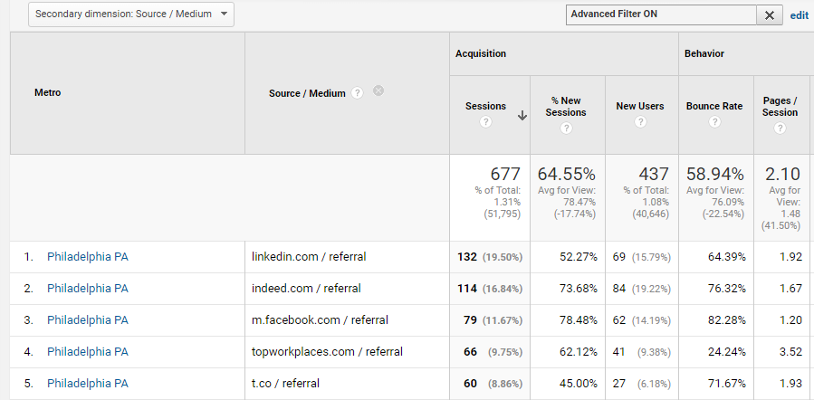
Step 5: Click "Apply" and now you have a list of the top websites that refer Philadelphia users to your website!
Not only can you now see which referral source drove the most traffic for the Philadelphia metro area, but you can see which source brought the most new users, and which source brought users who had the longest average session. Just take a look at all of the metrics that go along with the dimension pairs.
Caution: Sampling ahead!
Now before you go off and play around with dimensions in Google Analytics, be wary of the threat of sampling that comes along with getting too specific in your data pulls.
Using secondary dimensions along with segments or on too long of date ranges poses the risk of sampling, which can reduce the accuracy of your insights. Head over to Michelle’s blog post for tips on how to avoid sampling when using secondary dimensions!
Searching for an analytics partner? Drop us a line!


