Google Analytics Custom Reports are an oldie but goodie.
Pre-Google Data Studio, custom reports were our only way within the Google Interface to slice data outside of the default reports. Custom reports still provide a valuable way to quickly:
- Review & monitor custom metrics & dimensions in the interface
- Create a custom automated email report
- Create a custom report quickly without needing to layout/develop visuals as in Data Studio
If custom reporting is one of your primary needs, you should also check out our guide to Data Studio. But for some quick simple custom reports, read on.
Where to Find Custom Reports
Navigate & Create Custom Report
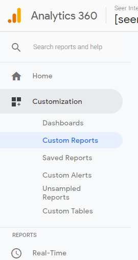
Logged into Google Analytics, click on the left hand navigation bar: Customization > Custom Reports
Click “+New Custom Report” to get started.
Pro Tip: Don’t want to start from scratch? You can modify many existing pre-built Google Analytics Report. Simply navigate to that report and click “Edit” in the upper-right hand corner.
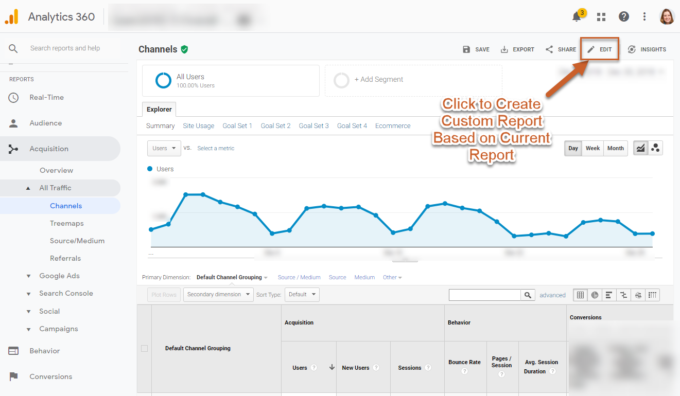
It will take you to the same new custom report screen, but pre-populated with the metrics from the report you were on.
Basic Types of Custom Reports
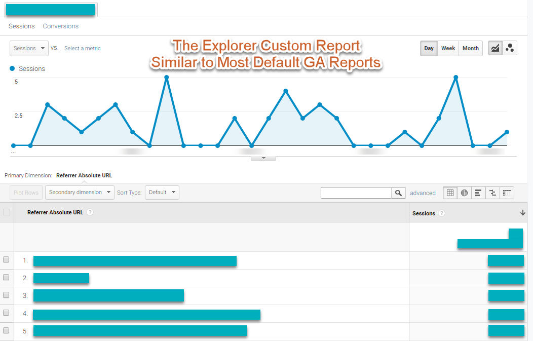
What is the Explorer report?
The Explorer custom report is like the majority of your built-in reports in GA. You have one dimension and a series of metrics, the first metric graphed across the top. You can customize the interaction with the report by selecting the dimensions that are used in the drill down. This is ideal for basic metrics and drilldowns, and for monitoring custom dimensions.
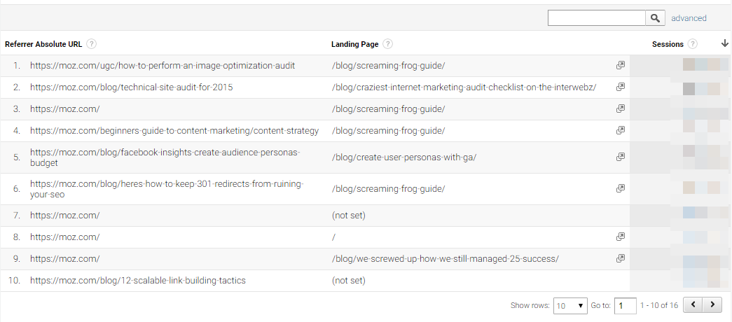
What is the Flat Table report?
The Flat Table custom report allows for a table with the unique combinations of up to 5 dimensions in a table with the metrics you select. This is similar to when you add a secondary dimension to a standard report, and can be ideal for common combos you like to see.
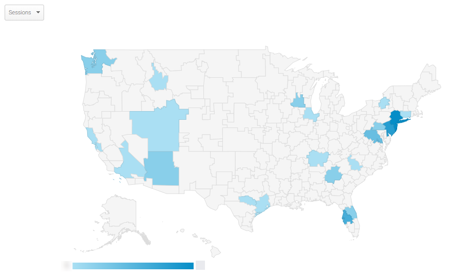
What is the Map Overlay report?
The map overlay report is similar to the default Location report and allows you to visualize any metric on a map for geographic analysis. This is ideal to monitor changes in your KPIs regionally whether within a state, country, or the world.
What is the Funnel (360) report?
The Funnel custom report allows you to create your own custom funnels to evaluate behavior, similar to goal funnel reports. This is a 360 only feature and you can read more about creating these reports in this blog post. Note, custom reports that use the Funnel option cannot be combined with Non-Funnel reports, and vice versa.
Google Analytics Custom Report Tutorial & Walkthrough
How to Create an Explorer Report
How to Create a Flat Table Report
How to Create a Map Overlay Report
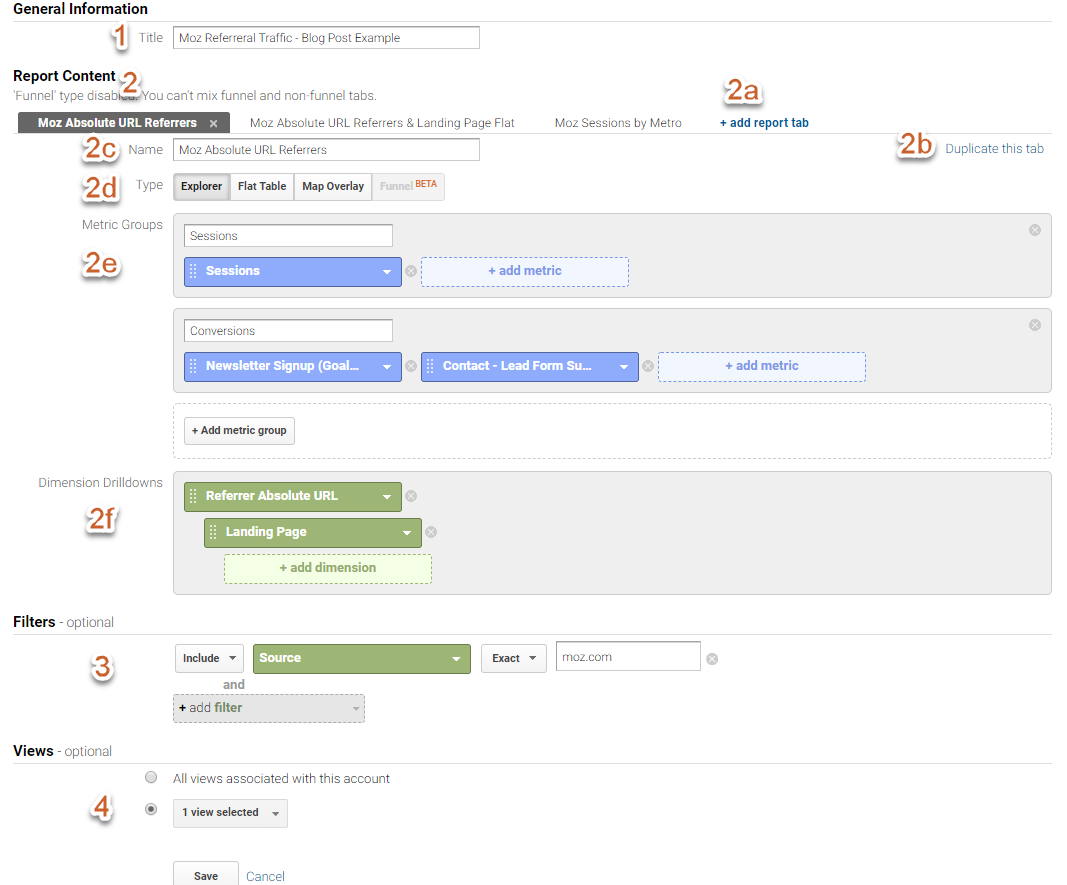
1 - General Information
Give your report a title.
Pro Tip: Make your name descriptive and informative. If you have a filter on the report, adding that information is helpful as well.
For example, “Michelle’s Device Report” gives minimal information on what is in the report vs “Device Performance Report - US Traffic Only” provides a bit more detail on what you’ll find in the report.
2 - Report Content
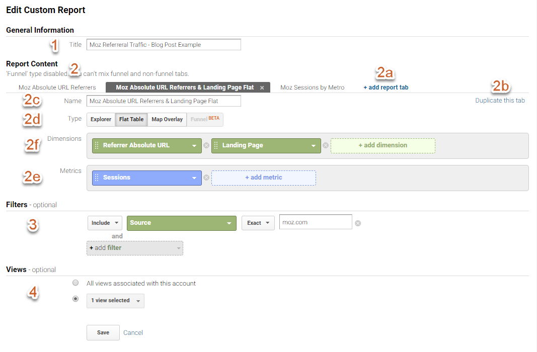
You start with a single report tab, but can add up to 5 additional tabs by either clicking “+ add report tab” (2a) or “Duplicate this tab” (2b)
In your final report you’ll be able to switch tabs by selecting between each one.
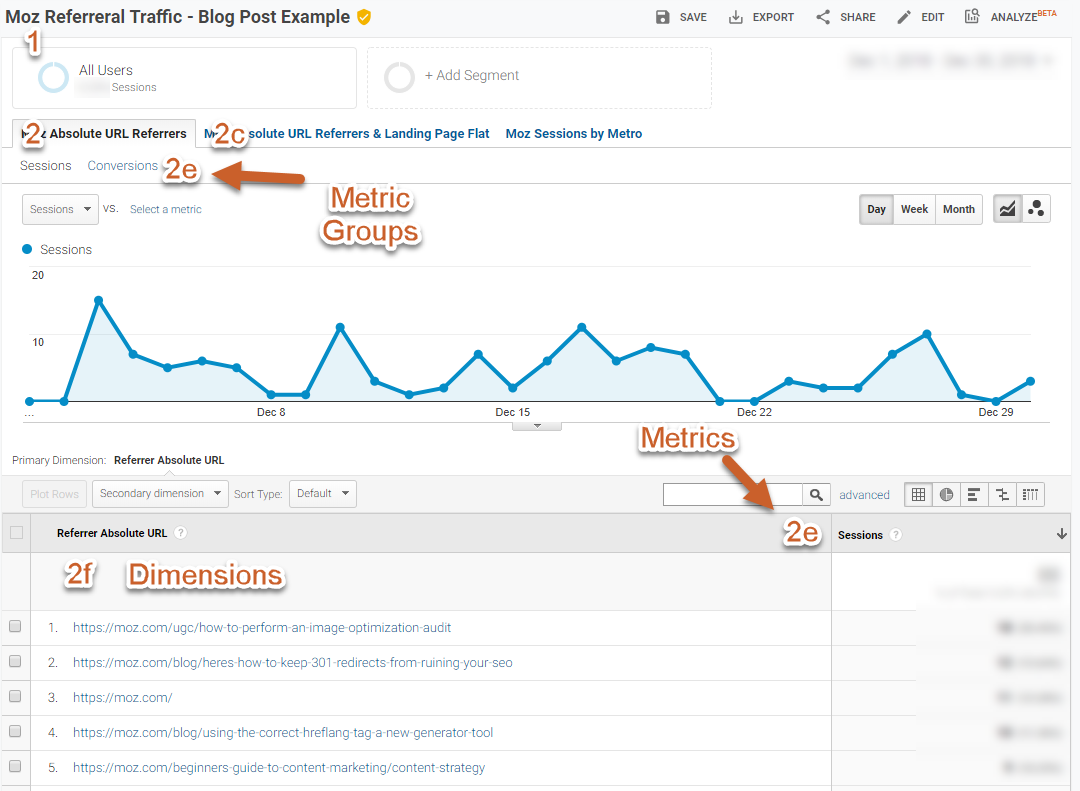
2c - Give your tab a name
2d - Select your report type (see explanation above)
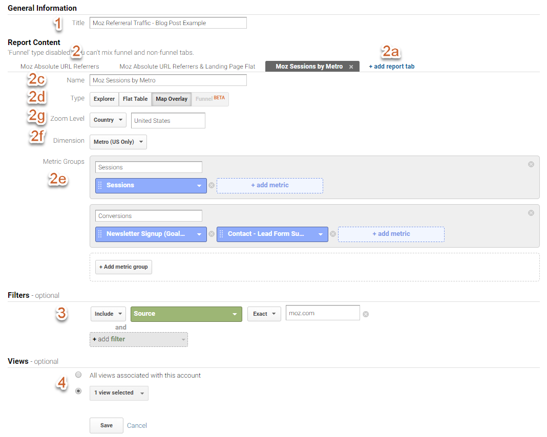
2e - Name your metric groups and add the metrics you want to see in your report.
In an Explorer & Map Overlay report you can add up to 5 metric groups and up to 10 metrics per group.
In a Flat Table report you only have 1 set of metrics, you can add up to 25 metrics.
Pro Tip: It’s easy to overfill your custom reports with lots of dimensions and metrics, but if you add only as much as you need to do your analysis/monitoring, you’ll likely get more out of your custom report. You can always edit it again later if you find you missed something.
2f - Select your dimensions.
In an Explorer report you can have up to 5 dimension drilldowns. These are the dimension that will load if you click a line item in your report.
In the above example, if you click on the Referrer Absolute URL (a custom dimension, fyi) we’ll get in the next view a break down of landing page for sessions with that specific Referrer Absolute URL.
In a Flat Table report, you again can have 5 dimensions, but these will all appear in the report as one line per unique combinations of the selected dimensions; you won’t need to click to see the breakdown.
In a Map Overlay report, the dimension is always geographic, and available options are based on your zoom level.
2g - Select your Zoom Level for Map Overlay Default is World level, but if you want to focus on a specific area you can.
In the above example, I’ve selected Zoom Level > Country and typed “United States” in the box to the right to focus on just US traffic and display the metrics by Metro.
3 - Add a filter to your report. Note Filters apply to the entire report, including every tab in the report.
In the above example, this report will only include traffic from a Source of moz.com.
Pro Tip: Instead of applying a filter to your report all the time, you can always apply a custom segment when viewing your completed custom report for more flexibility.
4 - Select what views this will be visible in. By default the view you are currently in is selected, but you can select additional views in the same or other GA accounts you have access too.
If you have lots of Views for multiple sites, you can choose to make the report for yourself and have it available in all Views your personal login to GA can view by selecting “All views associated with this account.” That single report will provide different data depending on the settings and filters for that view.
Pro Tip: To avoid irrelevant or excess custom reports, use the “All views associated with this account.” sparingly. Most of the time your custom report only needs to be viewed in 1 view, and you could max out your available custom report slots if always applying to all.
Here’s how it looks when you’ve hit Save:
Interacting With Your Completed Report
Now that you’ve completed a report and hit save, you’ll be taken to your custom report. The beauty of custom reports in Google Analytics is that you can interact with them in the same ways you interact with default reports. Including these things and more:
- Applying Custom Segments
- Changing or adding a second metric to the graph
- Change report date
- Adding a secondary dimension
- Additional filtering
You can also save, export and most importantly IMO, email this report as a PDF or data export. Setting up a recurring email of this report is a great way to get data in people's email - especially stakeholders that are not inclined to open up Google Analytics or Data Studio, but will open an attachment.
A Few More Tips for Creating a Custom Report
- Make a plan. Write on a scrap piece of paper what you want to look at, so you aren’t starting from scratch when you go in.
- Keep scope in mind. Certain dimensions & metrics with differing scopes can’t be combined. Google will generally stop you from selecting mismatches, so if you can’t find a dimension you think you should have, see if you’ve selected a metric that mismatches scope.
- Watch out for sampling. You’ve got a lot of flexibility in building out custom reports, but Google has to reprocess all this data. Depending on what you decide to combine, you could find yourself hitting sampling in your custom reports.

