Overview
Challenge
The Seer Analytics team identified under-performing PPC landing pages with lower than expected conversion rates.
There was an appetite to optimize and update UX to increase leads on these landing pages, but Seer and the client wanted deeper insights into the way users were behaving on the site to inform these changes before devoting resources.
Approach
Our first step was to understand the why behind under-performing conversion rates on one specific PPC landing page.
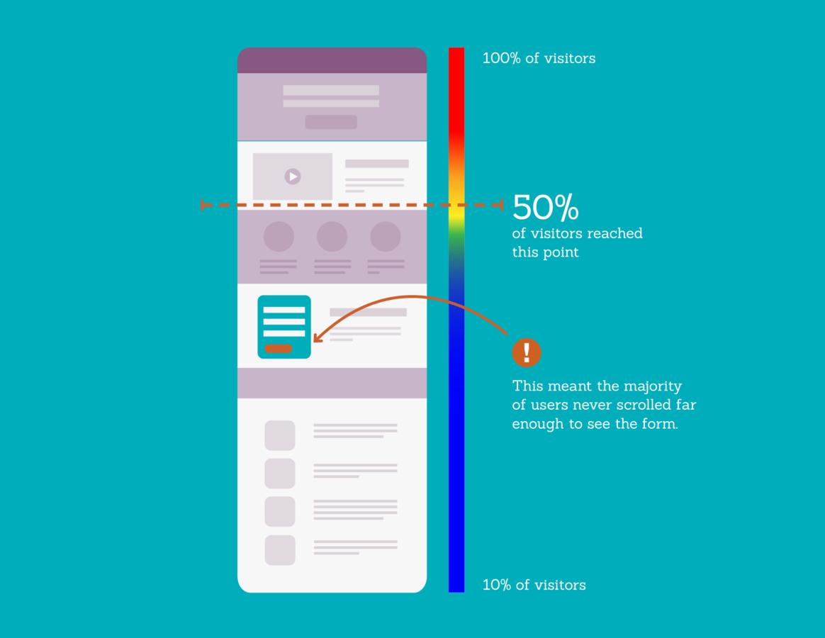
Since the form was located below the fold, our goal was to find out how many users had actually viewed it vs. how many left the page without scrolling far enough.
Through analyzing scroll tracking we implemented on the page, we found that more than half of all users weren’t scrolling beyond the 25% mark. This meant the majority of people weren’t seeing the form.

Our analysis also revealed that most users would leave once an auto-play video started and others would exit after scrolling far enough to see the company awards section.
Since the content on the page wasn’t providing value to potential leads, they were quickly leaving the site.
We also found that less than 1% of users clicked on the button that would take them to the form.
Our hypothesis was that people simply weren’t seeing the button (or aware that it was even there) due to it’s subtly against the background.
Execution
We crafted testing recommendations from our user experience analysis that addressed the core problems we knew users were facing on the page:
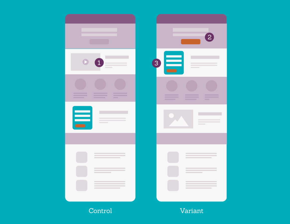
- Remove excessive content that wasn’t valuable to potential leads.
- Use color to make the main CTA stand out more against the background.
- Move the form up above the fold for maximum visibility.

Results
Upon implementation of our user experience testing recommendations noted above, the landing page increased lead conversion rate by 150% and drove 533% more lead form completions (+32).
The conversion button also had 12X the clicks post- vs pre-testing.
As a result of the significant performance change in anchor button clicks, our client continued to test making CTAs more prominent on various other landing pages, furthering the business impact this experiment had.
We originally set out to increase conversion rate, but the results of our audience-focused test spanned beyond this metric.
By simply making it easier for people to get the information they came for, we were able to also increase the number of qualified leads and traffic to the page.
