TL;DR: Using the Google Analytics API Add-on for Google Sheets and this template, easily compare two time frames and find trends or percentage increase/decreases.
This post was updated on 11/29/15 with drop down menus for all (except filter selection) input fields.
How much time do you spend looking at trends in Google Analytics every week? Every month? Or perhaps you spend more time exporting data from Google Analytics into Excel to analyze?

This is the second post in a series about the Google Sheet’s GA API Integration. If you’re unfamiliar, I suggest heading over to Kevin Rutter’s post - Automation Innovation: Beginner’s Guide to Google Sheets’ GA API Integration.
In this post I’ll walk you through a resource I created with the goal to quickly analyze week over week (or month over month, or year over year, etc.) percentage increase or decrease of two metrics and a single dimension.
If you’re hungry for something more complex, stay tuned for the next post in this series. This upcoming post will cover a resource that will automatically build a pivot table with up to 7 dimensions and 10 metrics over two time frames!
The Table Maker
I created this resource with the goal to make this repetitive and mundane task as intuitive and easy as possible. To get started click here to open the template, and then File > Make a copy… This will allow you to make changes to the sheet. Also be sure to use a Google login that has access to the Google Analytics views you are going to query. (This can be done later by granting access to that user and then opening it with that user.)
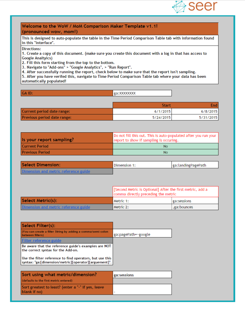
Now that you have your own Table Maker, let’s dig in! To make this process easier I’ve provided an interface tab: 
This is where you’ll enter your queries and parameters, run the report, and voila!
After running the report, the “Time Period Comparison Table” tab will automatically populate with all your data including two columns for percentage increases / decreases!
How does this interface tab work you ask? What do I put into the fields to get what I want? Have no fear, let’s walk through it together!
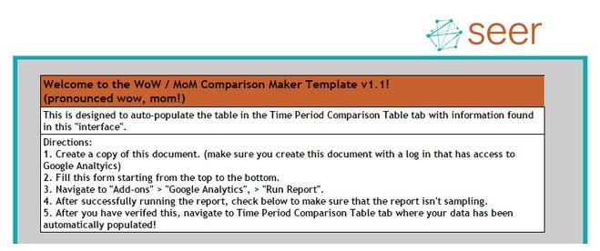
The first part of the “interface” is the directions, which are (hopefully) pretty straightforward:

Next we see the “GA ID:” field. This is where you’ll plop in your Google Analytics View ID. This can be found in the Google Analytics interface under Admin > View > View ID.
Note: This is NOT the Google Analytics tracking ID which uses the familiar syntax: UA-XXXXXXXX-X.

Following this section we see the date range fields. You’ll populate this with the two date ranges you want to analyze. In the example screenshots shown here, we are looking at the first week of June vs. the last week of May. This can be expanded to one month, or longer if your heart desires. Be careful though, as you increase the date range and add filters or segments Google may start sampling your data!

After this section is the “Is your report sampling?” output box. Nothing to fill out here, this is where you’ll want to check whether Google is sampling your data. If it is sampling, reduce the date range and/or remove filters and segments.
If you keep running into sampling (ie: you need a year or two’s worth of data with a filter or segment applied), stay tuned for the fourth post in this series which will cover a resource to aggregate data.

Next up is the dimension and metric selection sections. This is where you’ll define the query parameters. In non-robot language this is where you’ll tell the sheet what data you want.

This resource accepts two metrics but will work with one. If you opt to use two, include a comma directly before the metric (do NOT add a space or any other character).
Also in this section I’ve included links to Google’s Dimension and metric reference guide. Use this guide to determine the syntax you need for query parameters.
After you select your dimensions and metrics you have the option to create a filter.

Also in this section I’ve included a link to Google’s Filter reference guide for the Core Reporting API. Use this reference guide to determine the filter operator you need for your filter.
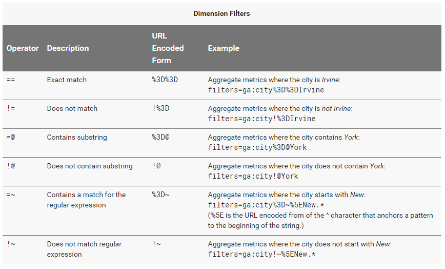
Here are the dimension filter operators from the reference guide:

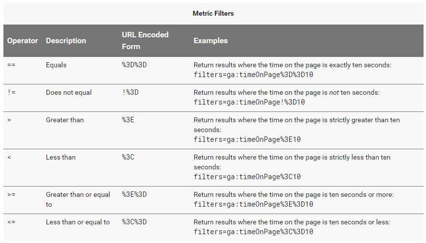
Here are the metric filter operators from the reference guide:

Keep in mind though that this reference guide is for the Core Reporting API, not the add-on.
To use filters here, use the following syntax to define your filter: “ga:[dimension/metric][operator][criteria]”.
The example I’ve provided is: “ga:pagePath=~google”. The pagePath is the dimension we want, the =~ is the operator, and google is our criteria. So this filter says, return me pages that match the regular expression “google”, in other words return me pages with google in the URL.
Last but not least, we have the sort section. This is where you’ll define how you want the table to sort the data.

By default, this section auto-populates with the first metric and sorts from greatest to least (mirroring how the interface works). You can enter any metric or dimension that your report is querying. You can also adjust the sort by removing the minus symbol in the second entry field.
That’s it, now you’re ready to run the report and watch your table create itself in the Table Maker tab!
Did you find something wrong with the Table Maker? Did you find this useful? Have an idea how I can improve this? I’d love to hear it, tweet me: @Jaycohh!
Here are the rest of the blogs in this series:
- Automation Innovation: Using Google Sheets to Simplify Google Analytics Reporting Pt. 1
- Coming soon: Using Google Sheets to Simplify Google Analytics Reporting Pt.2 - The Super Duper Pivot Table Maker
- Create a massive (or tiny!) pivot table using Google Analytics data in record time.
- Coming soon:Using Google Sheets to Simplify Google Analytics Reporting Pt.3 - The Data Aggregator
- Quickly combine day or week level data into a more suitable time frame (like a month or year)! Designed to get around sampling.


